After 65 years at Mad Magazine, comic artist Al Jaffee announced his retirement. Jaffee was best known for his Mad Fold-Ins, where folding the page would reveal a hidden message in the artwork. Plenty of examples can be found on the web. The problem is, they all show the before and after statically, side by side, which diminishes the magic (see here and here). There’s a whole generation who may have only seen the fold-ins in this format.
Of course I had to create the paper folding effect for the web. There’s many different ways to achieve this, but this approach is nice because:
- It’s CSS only, relying on no JavaScript.
- Uses a single image instead of requiring the image to be sliced up in Photoshop.
- Can be configured with just HTML by setting CSS variables in a style attribute.
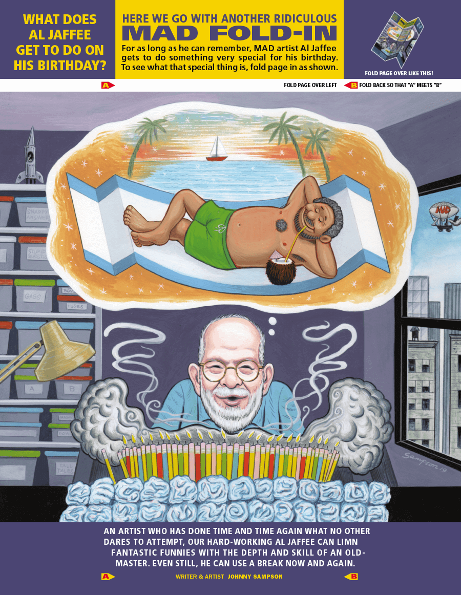
Here’s a demo of it in action, using artwork by Johnny Sampson in an issue that celebrated Jaffee’s 98th birthday. Hover or tap to fold.
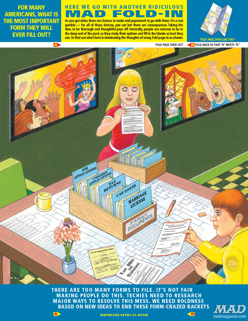
And another by Jaffee himself.
The Code
The HTML for the effect is fairly straightforward. You might be wondering about the standalone image element — it’s hidden but used to set the size and aspect ratio of the component. The image path is specified there and once again as a CSS variable to set the background image of the other elements.
<span class="jaffee" style="--bg: url('path/to/image.png');">
  <span class="a"></span>
  <span class="bc">
    <span class="b"></span>
    <span class="c"></span>
  </span>
  <img src="path/to/image.png">
</span>
And here is the CSS used to set the positioning, 3D transforms, and transitions.
.jaffee {
  position: relative;
  display: inline-flex;
  transform: rotateX(10deg);
  transform-style: preserve-3d;
  cursor: grab;
}

.jaffee img {
  width: auto;
  height: auto;
  max-width: 100%;
  max-height: 56vh;
  opacity: 0;
}

.jaffee .a,
.jaffee .b,
.jaffee .c {
  top: 0;
  display: inline-block;
  height: 100%;
  background-image: var(--bg);
  background-size: cover;
  background-repeat: no-repeat;
}

.jaffee .a {
  position: absolute;
  left: 0;
  width: 50%;
  background-position: 0 0;
}

.jaffee .bc {
  position: absolute;
  display: inline-flex;
  width: 50%;
  height: 100%;
  left: 50%;
  transform-origin: left;
  transition: transform 3s;
  transform-style: preserve-3d;
}

.jaffee .b,
.jaffee .c {
  position: relative;
  width: 50%;
  backface-visibility: hidden;
}

.jaffee .b {
  background-position: 66.666667% 0;
  transform-style: preserve-3d;
}

.jaffee .b:after {
  content: "";
  position: absolute;
  top: 0;
  left: 0;
  width: 100%;
  height: 100%;
  background-color: #000;
  transform: rotateY(180deg) translateZ(1px);
  transform-style: preserve-3d;
  backface-visibility: hidden;
}

.jaffee .c {
  background-position: 100% 0;
  transform-origin: left;
  transition: transform 2s;
}

.jaffee:hover .bc,
.jaffee:active .bc {
  transform: rotateY(-180deg) translateZ(-1px);
  transition: transform 2s;
}

.jaffee:hover .c,
.jaffee:active .c {
  transform: rotateY(180deg) translateZ(2px);
  transition: transform 3s;
}
Doesn‘t work right on iOS… :-(
Oops, WP added some line breaks to the code. It should work better now.
Trying on macOS and after the fold completes, I see a mirror image of what was “under” it.
Thanks for the bug report. What browser are you on? Working for me on Mac with the latest Chrome, Safari, and Firefox.
It happens when you hover and pinch-to-zoom (during or after the effect). At least here, Catalina, Safari 13.0.4.
I see the same behavior Thomas reports here in Safari on iOS 12.3.1.
Seeing same issue as Seth on Safari 13 – back image shows when loading via incognito, otherwise inconsistent: https://imgur.com/a/MFPQ5Mc
Works flawlessly everywhere else.
Thanks for all the reports, tracked it down to a z-axis issue in mobile Safari that only manifests at non-default zooms. Hopefully fixed now.
iOS
It does on my iPhone 8 with iOS 16.5.1
This is awesome! I had forgotten about those fold-ins, so this was nostalgic, and thank you for sharing the technique. It’s so fluid, I would have that it was canvas.
Brings back old memories beautifully. Thanks
Can it unfold as well? Part of the fun of these is being able to open and close to compare the images. Looks great though, nice work!
Ok, it does unfold for me, but I have to click/hover over the black area under the image, where the initial fold you can only select the image. Opera Browser (chrome) on a Pixel 2 w/ Android 10
Hey Pete, great, that’s working as intended. I’m using CSS with the :active pseudo-class, which has that limitation unfortunately. To get toggling, I’d have to use JS or some checkbox hackery.
This is so awesome, brings back childhood memories, thank you!!!
The real question – had anyone else ever heard the word “limn” before?
I thought a bug was cutting off the word when I first saw it.
I like it, awesome!
1) English dictionary definition of limn. to draw; portray in words;
2) Birthday: June 10th = my 80th
3) Masterful piece of work. Only took 65 years to learn.
Thomas,
I’ve run a MAD Magazine fansite (madcoversite.com) for decades, so this got my attention.
I like it a lot and plan to play around with it. My only objection is the mirror effect of the initial fold showing us what we’d see if we could look through the paper, most obvious with the mirrored lettering in your two examples.
In reality, you’d see a back cover. I’d almost like to see nothing or some unrelated solid color separating it from the fold-in.
It’s a minor thing, but it got my attention and I was confused about what I was seeing before figuring it out.
Nice job!
Hey Doug, I agree having a solid backface would be an improvement. I’ll look to add that. Showing the actual back cover from that specific issue, now that would be next level.
Awesome site by the way! I noticed you do have all the back covers archived…
If you’re still working on this, I might suggest trying a white background instead of black. Then our focus will be on the fold-in itself and not the black strip in your examples.
Great!!!
When the above images fold the right fold is black. I’m on a PC, Windows 10
Any way to make it bigger? Mine appears small on screen despite it being a 1200px wide image.
Great stuff though!
Thanks, I bumped up the image size.
Wow, this is so cool! I love how the CSS code can create a paper-folding effect for the web, it doesn’t rely on JavaScript.
Hey there! This post couldn’t be written any better!
Reading through this post reminds me of my good
old room mate! He always kept chatting about this.
I will forward this article to him. Pretty sure he will have a good read.
Thank you for sharing!