With the era of the humble unstyled and unscripted input field behind us, there’s increasing variety in how monetary inputs work on the web. And this inconsistency can lead to big mistakes.
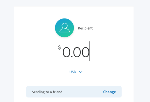
Take two cases from the same company. PayPal has you input money amounts by the cent. To input fifty dollars, you type 5 0 0 0.
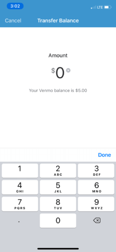
Paypal-owned Venmo on the other hand, has you input money by the dollar, typing 5 0.
Other sites have yet other variations.
Carelessly mixing them up leads to overpaying or underpaying by two orders of magnitude. You end up paying $0.20 for your share of dinner, or worse yet, $2,000 for a pizza. Thankfully, most websites mitigate this by showing a confirmation screen or prompting a warning. But where’s the fun in that?
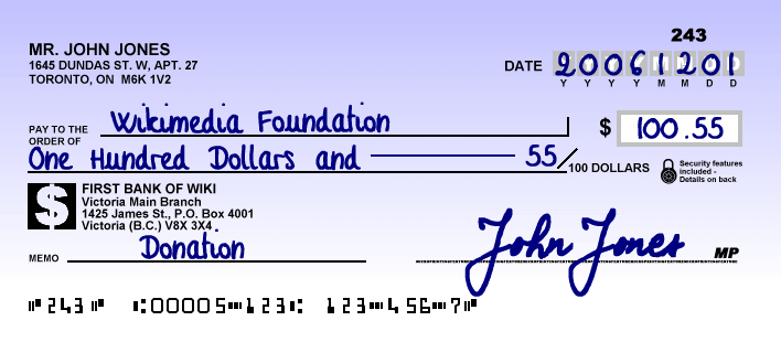
Instead, I propose we take inspiration from personal checks, the ones Grandma uses to pay for her groceries. Personal checks don’t have the tight feedback loop websites do, so how do they verify the amount you wrote is actually the intended value? That the decimal space isn’t a comma or an ink smudge? They have you spell out the dollar amount as text.
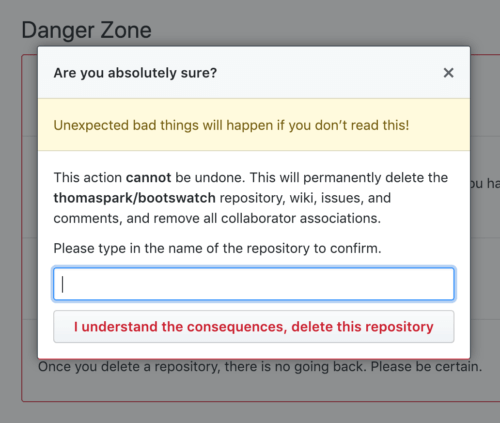
This design pattern isn’t unheard of on the web. On GitHub, high-stakes operations like deleting a repo require typing out the full name of the repository. The act of figuring out what to type and then typing it out is often enough to snap the user out of mindless, routine clicking when a catastrophic error could be made.
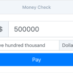
So why not for big dollar amounts as well? Here’s a quick demo made using words-to-numbers. Give it a spin.

-75