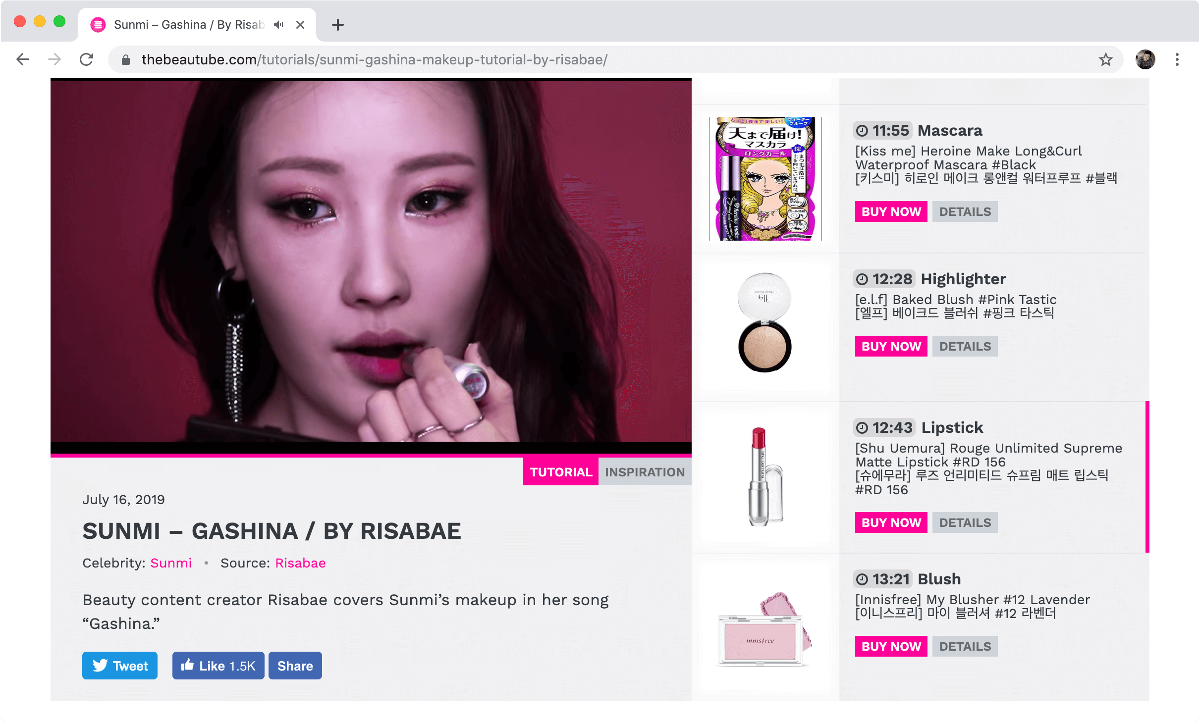
Recently I’ve been working on The Beautube, a site that integrates video tutorials with details about the products being mentioned in the videos, specifically in the realm of cosmetics.
This project has presented numerous challenges for how to design a tight, intuitive UI that makes efficient use of the available screen space when both video and web content are begging for more room.
Here I’d like to share a few lessons based on my experiences so far.
Vertical scrolling trumps horizontal scrolling
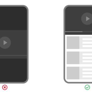
The basic requirements of the site are to display an embedded YouTube video, and alongside this, a list of elements containing product details. This list can be rather lengthy, so scrolling somehow has be involved. The question is how.
In our initial prototypes, I played with both vertical scrolling of the products adjacent to the video, and horizontal scrolling below the video. For horizontal scrolling, both a standard browser overflow scroll and a carousel were explored, even though carousels have been found to be ineffective.
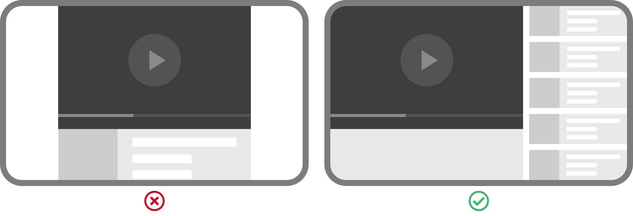
At first blush, horizontal scrolling is appealing. For desktops, the horizontal axis gives room for more products to be displayed at once. Horizontal scrolling also harmonizes well with the playback bar of the video itself.
In action, it’s a different story. Vertical scrolling is the standard behavior on webpages, and so familiar to users at this point that they instinctively know when to scroll down even when scrollbars have been removed. Horizontal scrolling not so much. Additionally, scrolling down with a swipe of your finger is an engrained and comfortable motion compared to horizontal flicking, especially for long periods of time. And most computer mouses have a scroll wheel in just one direction — you guessed it, vertical.
In the end, one of our early design decisions was to go with vertical scrolling and have the rest of UI accommodate it, even if it added some tradeoffs to deal with.

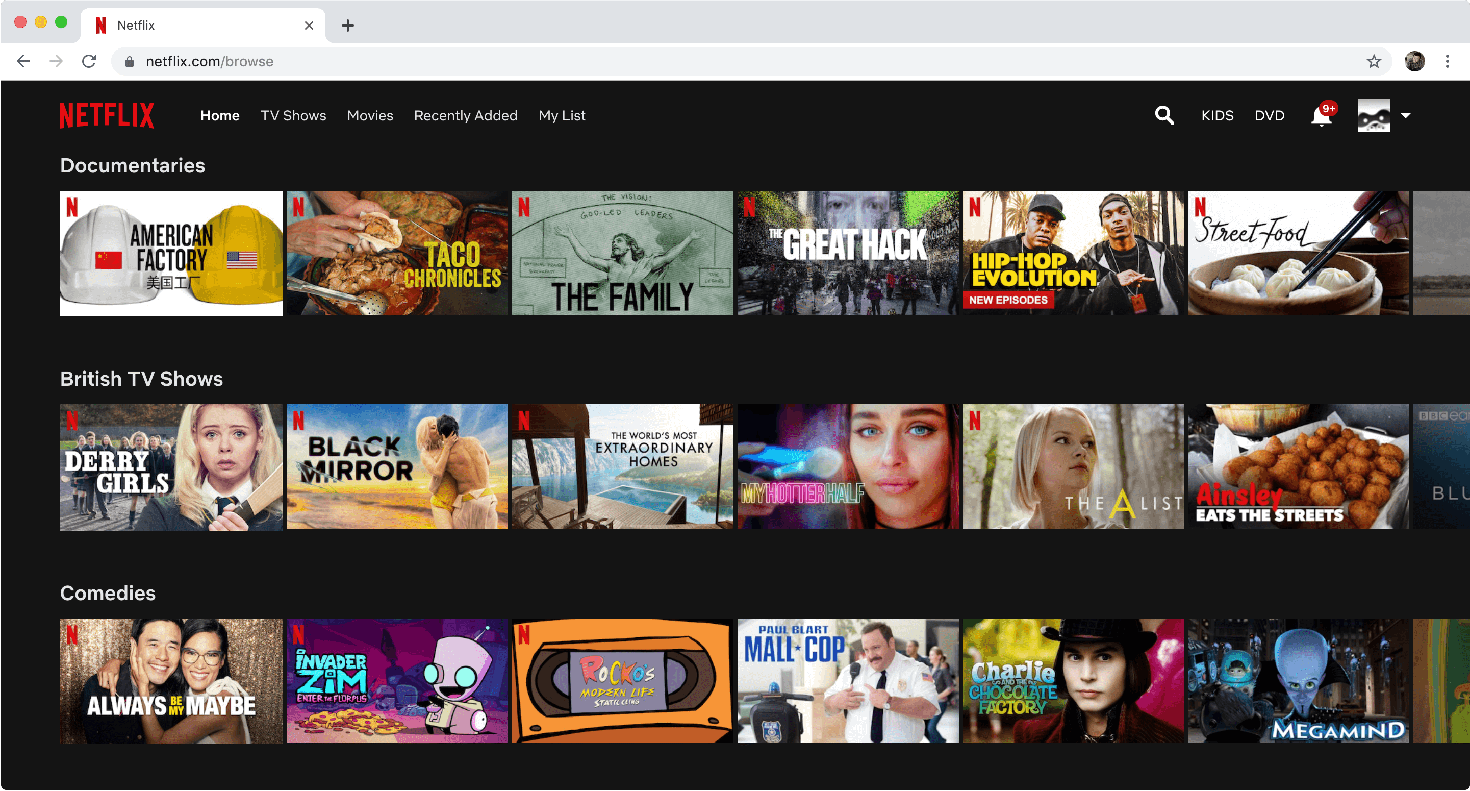
That’s not to say horizontal scrolling should be verboten. I imagine a strong case could be made for horizontal scrolling when there’s close integration with video playback with minimal user interaction. Or for bidirectional scrolling, as a secondary navigation.
Netflix is a good example of this, where users vertically scroll through categories, and then horizontally scroll through videos within a category.
Limit lists to a single dimension when possible
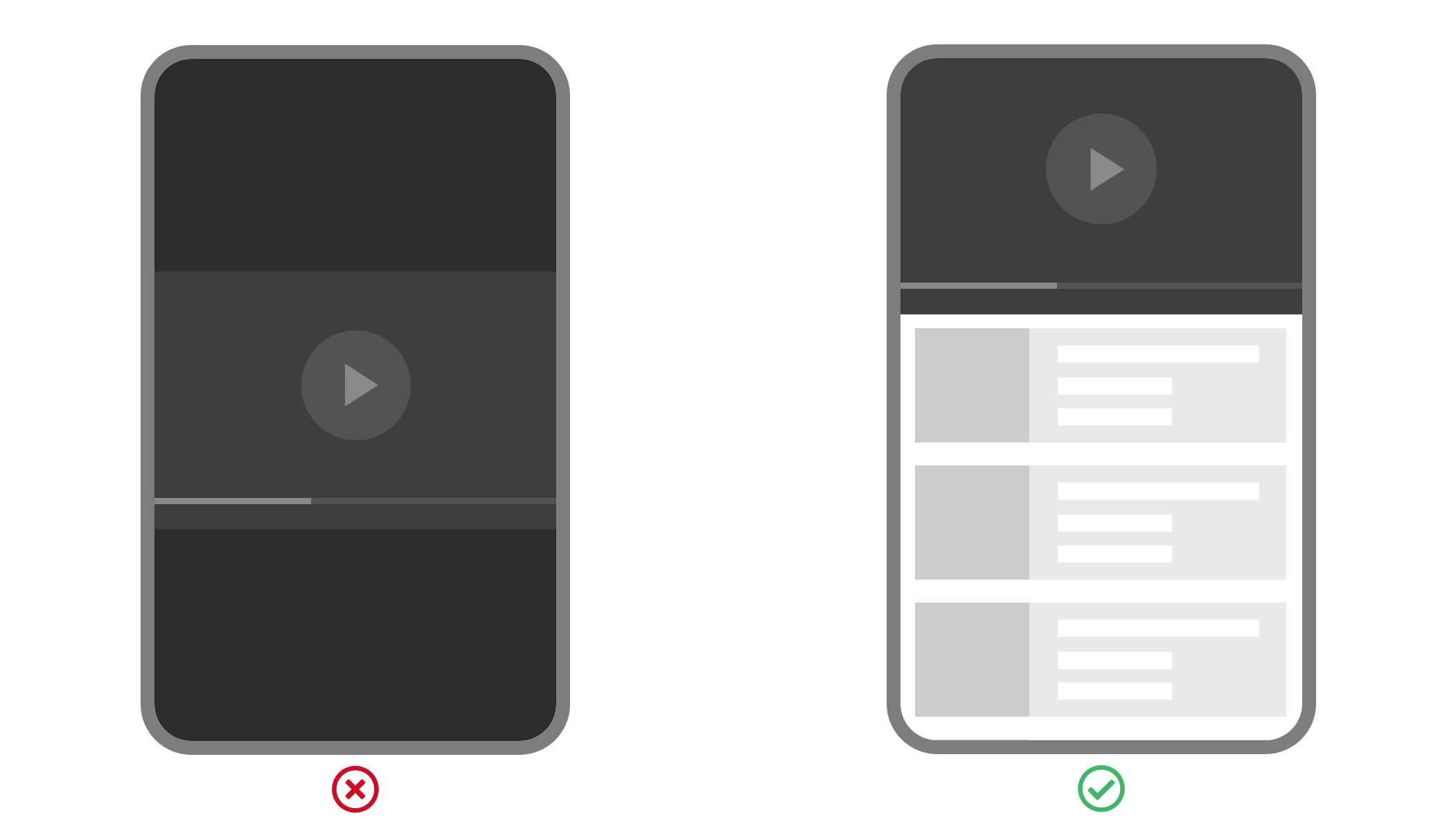
Having settled on a vertical list, I experimented with multiple columns, with the idea of increasing the information density. While I was able to squeeze a few more items into the visible part of the list, it came at the cost of readability. With a single column, users can quickly scan down the list to view all of the product images, all of the product titles, etc. When multiple columns are added, the user’s eyes have to dance back-and-forth as they make their way down the list, tiring faster and losing their place.
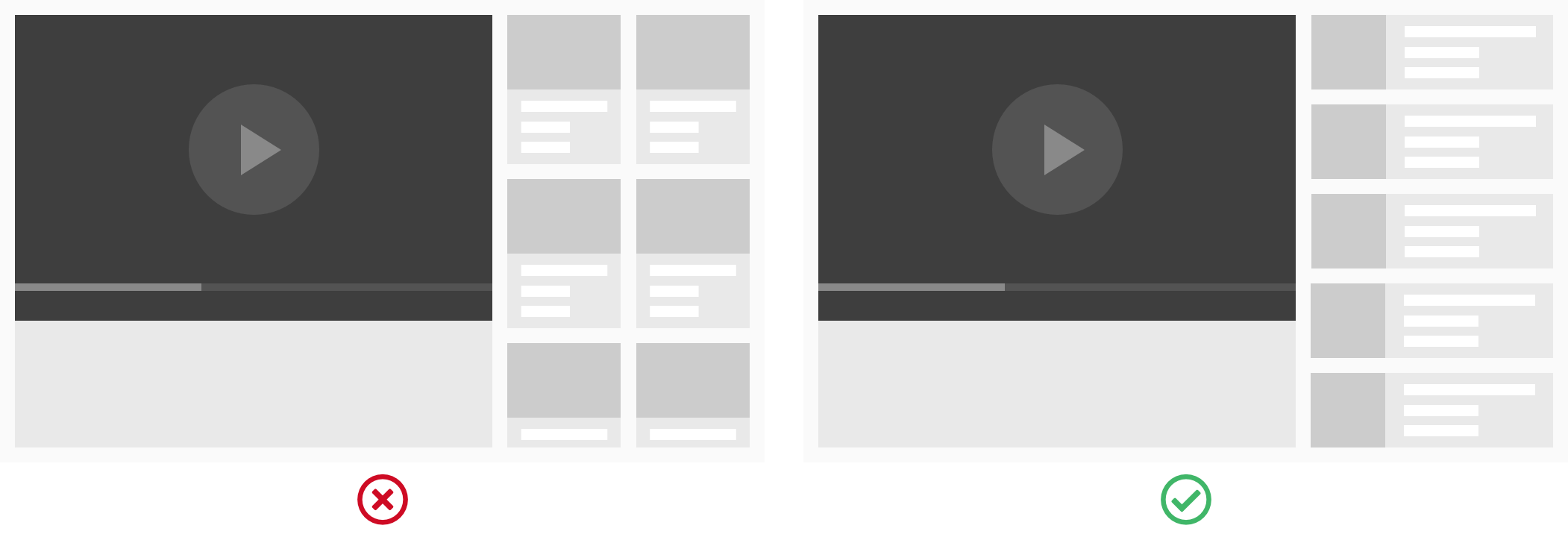
A single column works out in this case because the space available to the list is rather narrow to begin with. If the space were much wider, staying with a single column could lead to text that pushes beyond the optimal line length, causing readability to suffer in a new way.
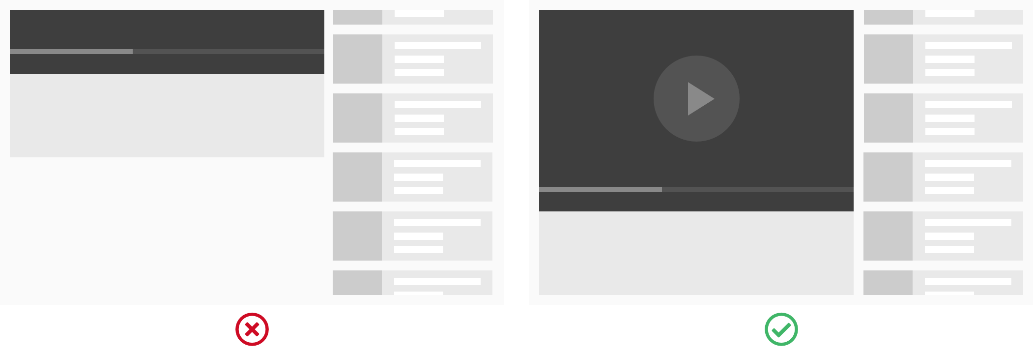
Keep video in view with sticky positioning
By default, when scrolling through the list of products, the video will also scroll off the page. This forces the user to jump back and forth, when the ideal behavior is to be able to reference both at the same time. Fortunately, the CSS property position: sticky comes to the rescue. Setting this on the video will keep it in the viewport, sticking to the top or bottom edge of the widow, so long as the list is on screen as well.
For media queries, make use of orientation and aspect-ratio
When using media queries, both developers and frameworks often rely solely on breakpoints set at different widths. For basic cases, such as turning two columns of text into one for mobile, this approach suffices. But for more complex situations, adding the orientation and aspect-ratio features to media queries can make all the difference.
Consider our project, which needs to squeeze in both the video player, which is always present at its 16:9 aspect ratio, and the product list, whose design we have more room to play with. The naive approach of moving to a single column for smaller devices only works if the device is being held in portrait mode. If rotated to landscape however, the two-column layout will make better use of the space.
As a side-note, remember to make your videos responsive. If you’re delivering your video in an iframe, as is the case with YouTube embeds, you’ll need some CSS trickery to get this done.
Disable the default fullscreen behavior on mobile
One gotcha to watch out for is that on iOS by default, YouTube will automatically play embedded videos in full-screen, rendering all of the above design improvements moot. To allow mobile users to view all of our content simultaneously, enable inline playback with the playsinline parameter.
Two-way coupling between video and web content
Everything up to this point has been about layout and positioning. But integrating video content with the web also affords integrated behaviors. For this project, two-way coupling was implemented, meaning that the state of the video content affects the web content, and vice versa. Communicating between the two is made possible by the YouTube Player API, which exposes video player events like onReady and methods like seekTo() and getCurrentTime().
In the list, each item has a clickable timestamp that seeks the player to that time in the video. On the video side, a listener checks when the current time elapses past a new timestamp, highlighting the respective item and scrolling it into view with the native method scrollIntoView().

The lazy auto-scroll
Lastly, I adopted what I call the lazy auto-scroll. By this principle, the current active list item is:
- always kept in the viewport
- but by scrolling with the least amount of movement possible
Let’s take a few concrete examples. When the newly active item is already within the viewport, no auto-scrolling happens, regardless of the item’s position. When the active item is above the fold, which can happen when the user has browsed around the list, the list auto-scrolls to put the item on the top edge of the viewport. When the active item is below the fold, the list auto-scrolls the item to the bottom edge of the viewport. And the auto-scrolling check happens only when the video reaches a new timestamp.

The effect of this lazy auto-scrolling is that there’s less unnecessary movement creating distraction and a chance for the user to lose their place. If the active item is a few pixels off from the top or center of the list, does it really need to scroll those measly pixels?
Lazy auto-scrolling also gives users freedom to browse around a bit without auto-scroll hijacking their actions. Only when the video reaches a new timestamp, the list re-orients itself, benefiting users who do want to navigate back to the current active item eventually.
Putting it all into practice
Applying all of the lessons above, here’s the current, though likely not the final, state of The Beautube.
Nice article! Thanks for sharing.
Very interesting, thank you :)