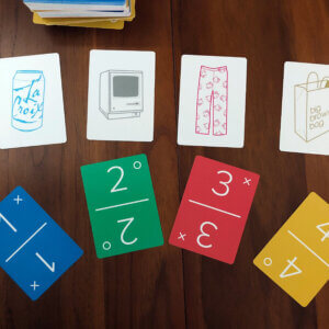
The Obsession
My family gets competitive with card games. Our latest obsession is Dutch Blitz, a fast-paced game that seems somewhat regional due to the Pennsylvania Dutch influence.
To give you an idea of just how seriously we take it, we have a spreadsheet to keep score and maintain lifetime stats. Feel free to fork it for your own use.
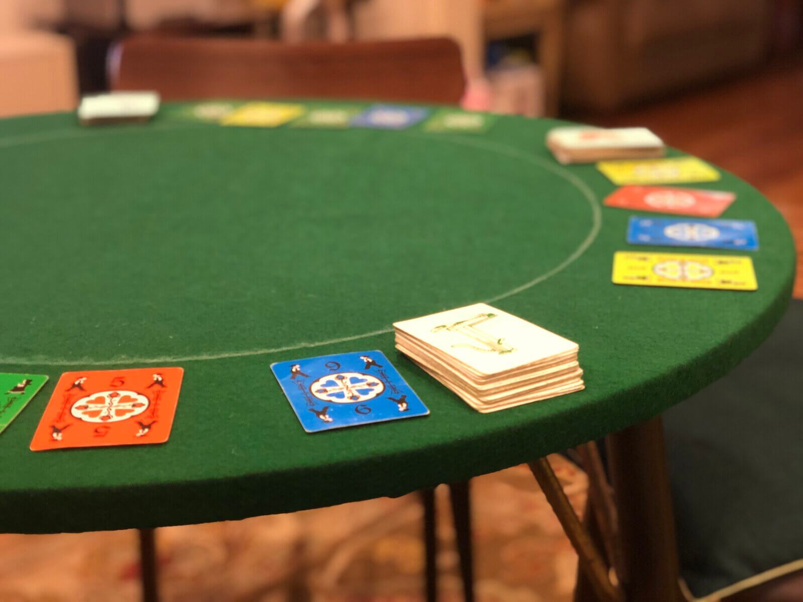
We’ve also purpose-built a Dutch Blitz table with green felt.
The latest endeavor? To create custom cards in the style of Dutch Blitz / Ligretto / Nerts.
The Design
The Dutch Blitz cards definitely have a charm, but they’ve also got some usability issues. The color combinations have poor contrast, black on blue in particular. Differentiating the boy and girl takes an extra second, which matters in the heat of the moment. The numbers are small and can be tough to read from across the table.
Flip the cards over, and the vintage etchings — the pump, carriage, plow, and pail — are endearing but have no personal significance to us. One is assigned to each player, but keeping straight which is whose takes a few rounds.
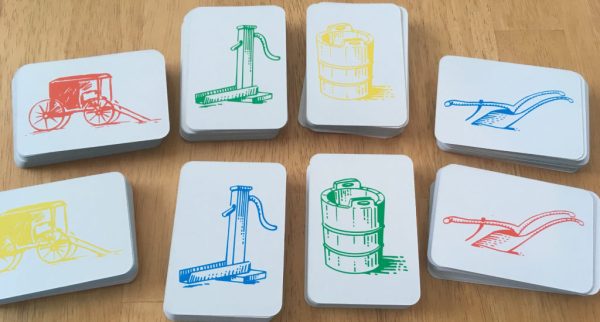
For more than 4 players, the expansion pack is just a palette swap of the same four objects.
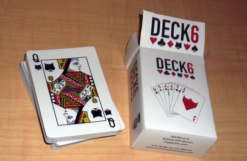
If a 5th and 6th suit can be devised to fit with classic poker cards, it shouldn’t be tough to spot more things around the farm for Dutch Blitz.
The Redesign
And so I took the opportunity to design custom cards and have some fun with personalized illustrations.
For the redesigned faces, I took a modern, minimalist style inspired by Minim playing cards and UNO Minimalista.
For the backs, I went with branded objects we already associate with different members of the family. Here are the results.
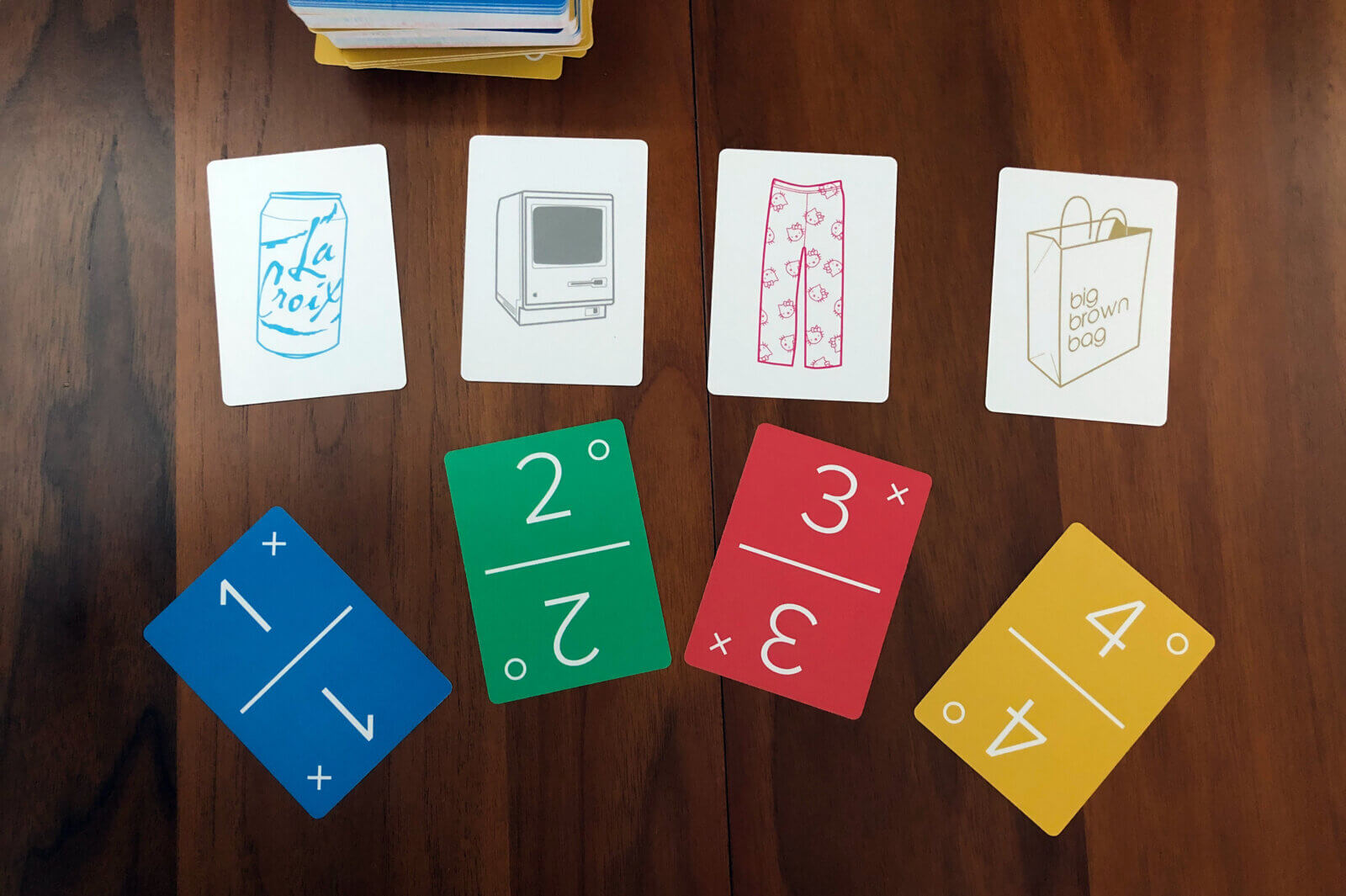
You might be able to guess which object is mine.
Here are some alternative backs I had printed up for a gift.
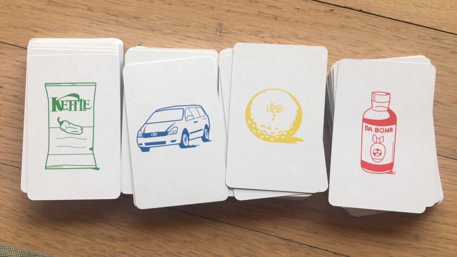
Now to playtest this deck and no doubt iterate on it, getting ever closer to the ultimate Dutch Blitz experience.
Update
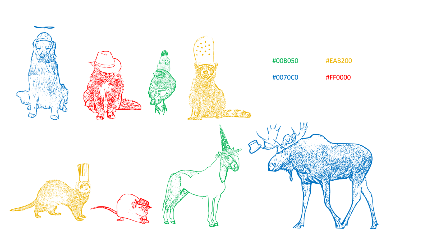
Leeanne has graciously shared her own spin — silly animals in silly hats! They capture the art style of the original game perfectly. My personal favorite is the raccoon in a Croc. What’s yours?
Download her designs in PNG and SVG format.
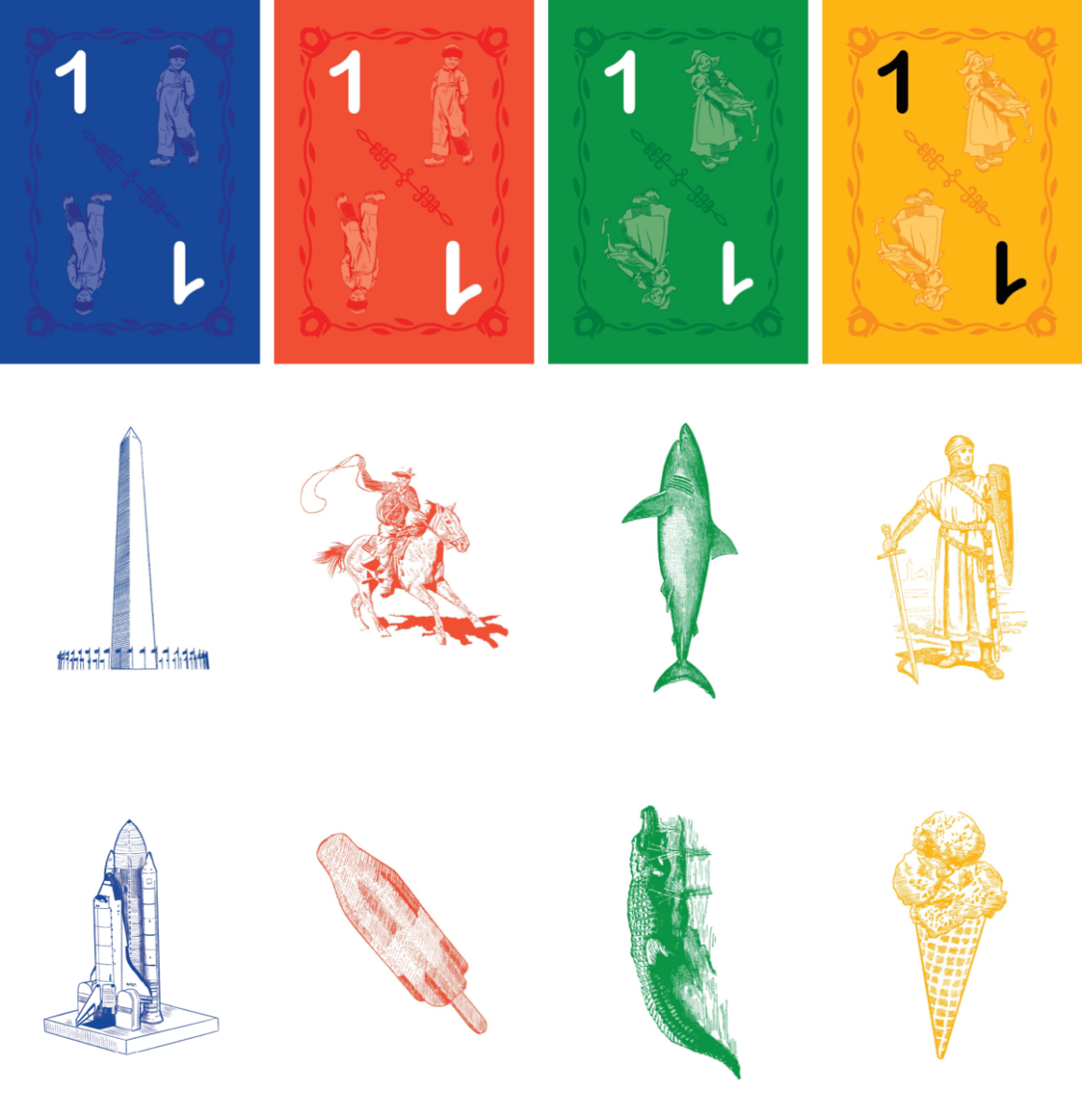
Lance Smith also shared his take, representing his family’s ties to DC, VA, OK, and FL.

This is exactly what I was thinking of doing!
Did you have a company print them for you? If so, do you mind sharing their contact information?
Hey Amber, that’s awesome! I got them printed at MakePlayingCards.com.
I would love to make some of these custom blitz cards. Do you happen to have a template for the pack that we could use?
Here are the assets in png and svg. Would love you see what you do with them.
https://thomaspark.co/wp/wp-content/uploads/2022/01/custom-dutch-blitz-assets.zip
This is awesome! How did you get the drawings for the backs of the cards like the minivan and the DaBomb hot sauce?
Thanks, I traced source photos in a vector app.
Omg! this seems so fun!
Hey Thomas! I’m trying to create my own using the same website you mentioned in another comment. May I ask you, did you buy a deck of 320 (8 colours * 40 cards each) once or did you structure it a different way to save money?
Hey! Basically yes, I ordered the initial set of 160 to see how they turn out. Then I put in another order for 160 as kind of an expansion pack.
The biggest question marks for me were print color/quality (which were fine) and finish. I ordered this sample pack ahead of time to get a sense of the different finish options.
Thank you for sharing all the files! I learned how to play over the weekend and immediately hopped online to buy a deck. I saw this page and loved the style! I wanted a quirky style for the backs of the cards though and thought others would like them too. I made some vector images of animals in hats! I can send to you so you can share the svg and png assets as well! I also did 8 designs for two different decks
Hi Thomas, I’m in the finishing stages of my custom set, design is uploaded and ready for print, but I was curious what size and finish you went with. I can share the design with you if you would like, thanks.
Hi Lance, I went with P10 100% premium white plastic card stock at 63×88mm.
It’s durable but wish it were a tad less slippery for stacking, and more matte for visibility in direct light. I ordered a card stock sample pack beforehand which was helpful for decision-making: https://www.makeplayingcards.com/design/card-stock-sample.html
Would love to see your custom set. Feel free to share here in comments or by email.
Hi Lance! Amazing reformat of the basic cards! Do you have the svg file!?
Hugs from Costa Rica!
Thanks so much for sharing this! It inspired me to put together a custom set for a friends birthday.
I do wish I’d checked the comments earlier though, I re-made very similar fronts to what you did before I realized that you’d shared your assets and I could’ve saved myself a ton of time!
Hi, what card style do you pick on MakePlayingCards.com to be as close as possible to the original Dutch Blitz cards? They have a very unique style/feel that I love.