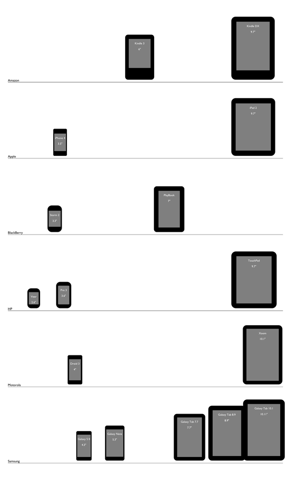
Yesterday, I showed a graphic that lays out popular devices by display size. In this post, I want to show a version created using HTML, CSS, and JavaScript. The upside of doing this programmatically rather than manually in a drawing program is that it’s easier to update, adjusts to each user’s viewport, and can be made interactive. The downside is that sometimes web technology isn’t up to the task of rendering something nicely yet.
With the programmatic approach, the main function takes in a set of objects, each of which represents a device with corresponding specs: display size (diagonal in inches), display resolution (height and width in pixels), and physical dimensions (height and width in inches).
Each device is then rendered as a div. The aforementioned specs are used to determine its size and shape, with the content area of the div acting as the display and its border serving as the bezel. The display size is also used to determine the horizontal position of each device.
There are also three optional parameters. Scale factor defaults 1 millimeter to 1 pixel, but can be varied per device. Vertical shift centers the display in the bezel by default, but can be tweaked for certain devices such as the Kindle. Finally, curve factor can customize the roundedness of a device using the border-radius property, useful for devices like the Veer, although there are some kinks with that.
Below is a screenshot of the results, and you can view the live version here. You can also have a look at the code, but pardon the cruft as this is just a proof of concept.

