I just returned from another great Mozilla Festival. For most of the attendees, Mozfest seems to be a chance to kick back and celebrate the daily work they do with their teams. For me, it was a rare opportunity to get face-time with some really talented people working on the same kind of problems I do. Trying to make the most of that, I felt a bit intense.
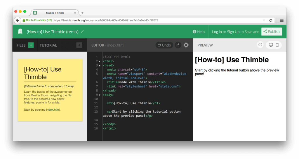
One of the sessions I attended was on the new version of the web editor Thimble, with overhauled architecture and new look. I was heartened to find that embedded tutorials had made the cut. Not only because this was a feature I had worked on (although admittedly there’s some of that), but because I believe Thimble’s greatest potential is in supporting learning both formal and informal.
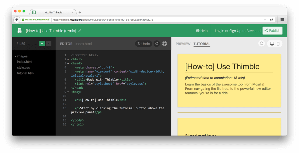
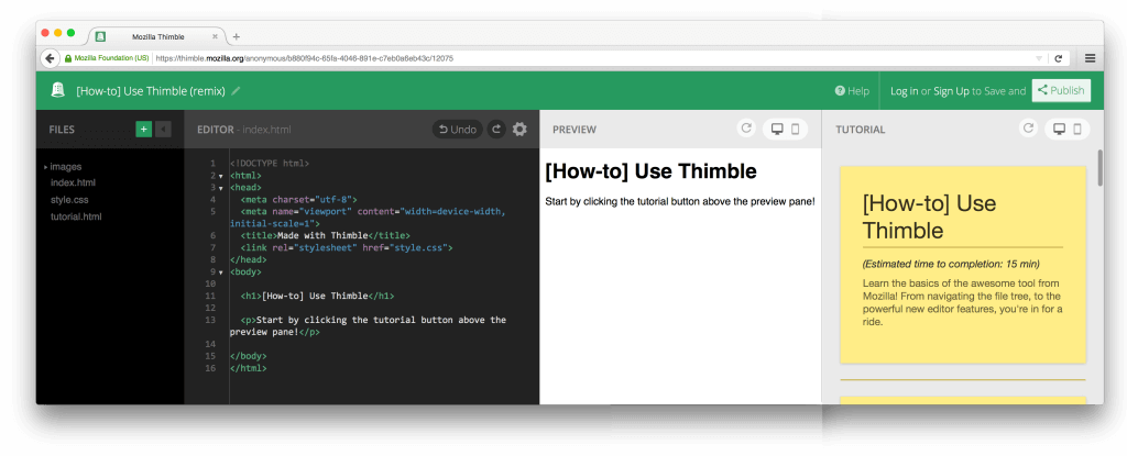
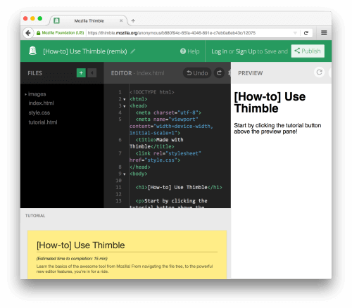
The tutorial feature was not entirely unchanged however. Before, tutorials were presented in a third column. Now, due to the new filesystem panel, there is less space available and so tutorials are relegated to a toggle in the preview panel. While adding new tutorials is easier than ever (just add a tutorial.html to your project), they can no longer be viewed simultaneously with the output. Several of the session attendees raised concerns about how much switching back and forth this can cause, sparking discussion about the placement of tutorials. Ideas were tossed around, including a bottom panel and inline comments inspired by Fancy Comments.
When we originally implemented tutorials, we experimented with 6 variations, including the side panel (dubbed Sidebar at the time), bottom panel (Drawer), and inline (Expander) versions. Unfortunately, a toggled view was not one of the designs tested in this study. Based on user ratings, Sidebar, Drawer, and Expander ranked as first, second, and third most popular respectively, matching our own intuitions.
But beyond the question of “which?”, there is the “why?”. To answer this, I decided to revisit the old data, doing a quick qualitative analysis of what the participants found positive and negative about each design. For the frontrunner designs, I’ll briefly summarize these point below, and then propose a couple of alternatives.
Sidebar
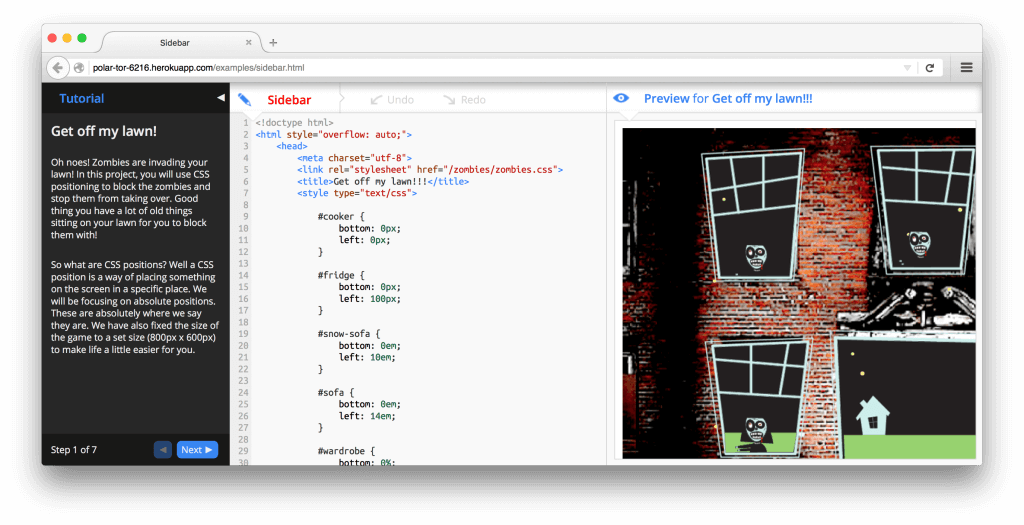
For the sidebar design, most of the complaints related to the cramped view. Using up some space is unavoidable, but the sidebar can be especially problematic since it spans the whole window vertically. Significant space could be wasted on larger displays, but the lack of space was particularly a problem for smaller windows.
This one works best when I use it on a large-screen monitor. When I adjust my browser to a smaller size, some corresponding code parts are not automatically visible.
A few commented that they found it uncomfortable to scan their eyes from the sidebar to the code to the preview and back again. The ideal order of panes is an interesting open question.
Don’t care for this design. Harder for me to read far left block of directions, switch quickly to code, and follow what i’m doing to the right. Feels more difficult to concentrate.
As far as positives go, most boiled down to a clean and simple design that was consistent with the rest of the interface.
Fit in well visually with the columns interface of the thimble. Obviously the tutorial “section” of the page. Very distinct.
Respondents noted that the sidebar was good at getting out of the way, which was a theme that came up frequently when discussing the other designs as well.
Very similar to Drawer, but better, as it doesn’t pop over the code nor does it effect the editor space nearly as much (losing vertical space from the sides less frustrating then losing horizontal space from the bottom). Also how it takes space from both the input and output sides equally, rather then just squeeze the input.
A couple of the respondents commented that when it came to longer tutorials, sidebar was best-suited design.
This looks like a better interface. It is easier to read long instructions.
Drawer
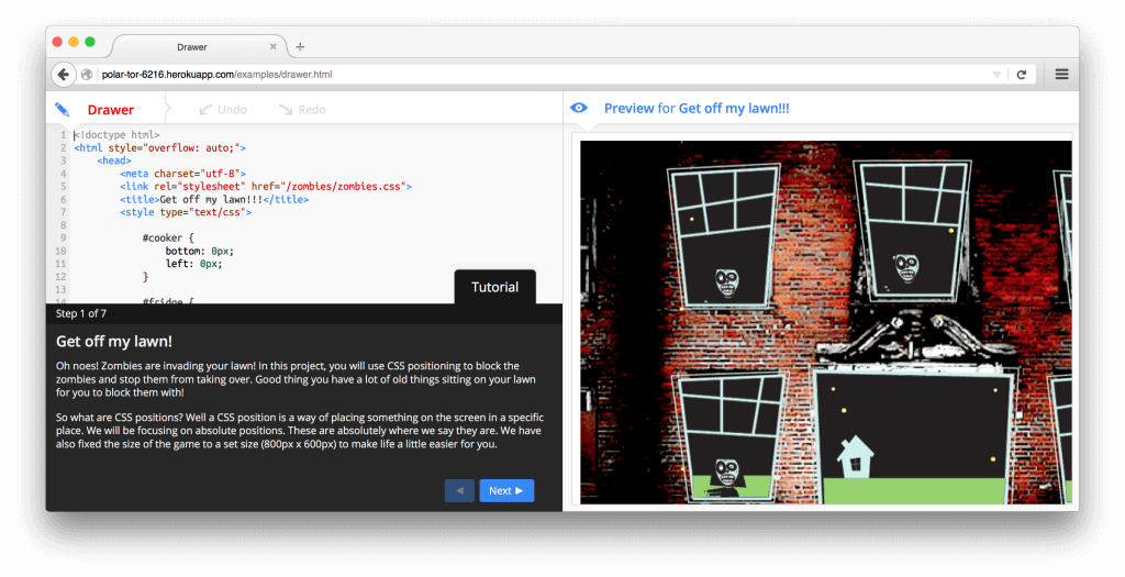
For the drawer design, most of the complaints related to reduced space for the code editor. Some respondents felt that it was annoying and got in the way.
From the start it feels like it’s blocking your access to the code (which it is, of course, but I’m talking about the sensation you get).
Like the sidebar, there were several comments that it felt unnatural to scan your eyes from the code editor down to the tutorial. Again, this is an interesting question with no obvious answer.
it was hard for my eyes to look at the bottom of the screen for instructions and then go edit the code. It was even harder when I had to scroll the code to see where I am.
Respondents liked that the horizontal space of the existing panels was not compromised.
Makes the most of use of the space available therefore there is no need to scroll from left to right as much on the preview screen.
But perhaps the biggest win was that it was really easy and obvious to toggle into and out of view.
Can easily move the tutorial out of the way. Tab is within coding area as well so I didn’t have to move the mouse as far.
Expander
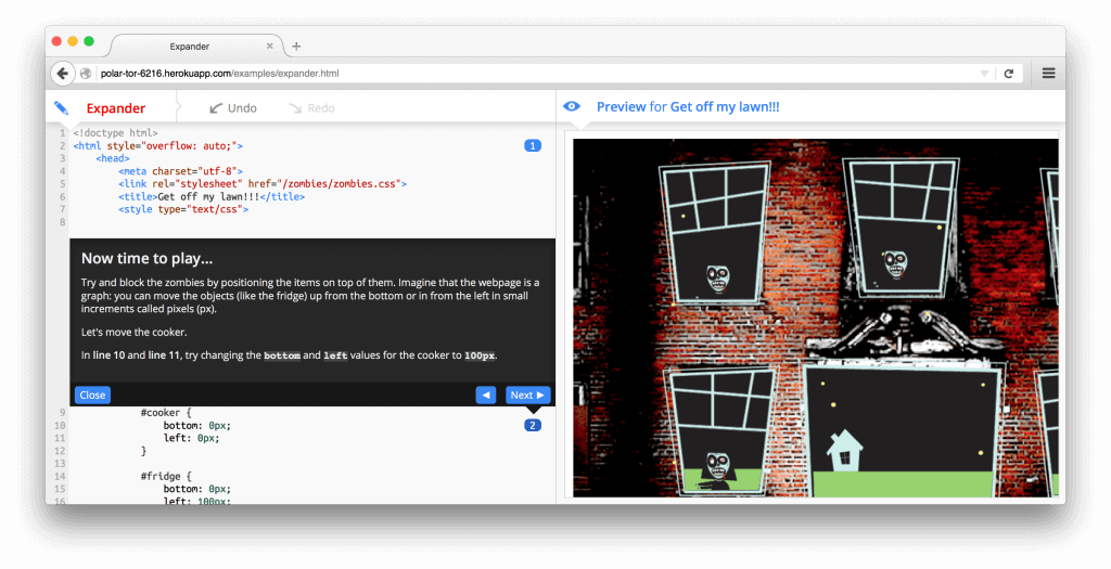
For the expander design, several respondents found it unintuitive. In particular, they reported trouble accessing the tutorial again after they had closed it, feeling that it was “gone forever”.
Visually I found it hard to find the tutorial again after I “close”d it. Also, the animations right on top of hte code I was editing was distracting and felt like it was slowing me down considerably. Though it pointed me to the right part of the code it wasn’t obvious in the beginning.
The majority of negative comments related to breaking the flow while coding and obscuring the overall picture of the code. They complained that the tutorial was constantly jumping and shifting the code around.
Felt it cluttered and interfered with the code. felt annoyed each time I need to click the button to hide it. Dont mix it up with the code.
Some of the respondents appreciated the tighter integration between instruction and code.
I like this design the best so far. Tutorial is directly next to the code that is meant to be changed so you know exactly where you are in the code.
A few comments noted that the design was fun!
It was fun, funny, and interactive. It gave me tasks to do and while I did them, I learned different ways to do the same kind of task. It made it more memorable than looking up the method in a book.
Looking back at the user ratings, expander was the only design novices preferred more than experienced coders. For experienced coders, it’s likely the novelty would wear off very quickly.
Proposed Designs
Based on the feedback, it’s clear that sidebar is the preferred position, with drawer a solid alternative when horizontal space is at a premium (as is the case with the new Thimble). Keeping these comments in mind, I wanted to put a couple more possibilities out there.
The first is to keep the sidebar layout, but toggle it through the file panel instead of the preview. For beginner coders, it’s critical to have a tight feedback loop between editing code and seeing the results, cause and effect. At the same time, having a tutorial suggests that it contains instruction that’s needed to guide their activity. In contrast, many beginner projects involve only one or two files at once, and switching between files is a relatively infrequent task. The ideal setup, then, it to have the editor, preview, and tutorial on screen at once.
One of the main drawbacks of this occurs when beginners are first learning to relate markup in an HTML document with stylesheet rules in a CSS file. In this case, the proposed design would actually cause more friction. To mitigate this, file references could be supported within the tutorial. Like the smartline feature in the original tutorials, which allowed a tutorial author to create interactive links to specific lines of code, these references could allow the user to jump to the most relevant files from within the tutorial. Yet another drawback is that users could lose awareness of the file panel entirely, especially if they grow accustomed to the file references within tutorials.
The second is to offer a responsive layout. For larger screens that can afford it, the tutorial can be displayed as its own panel, giving Thimble a 4-column layout. For smaller screens, the tutorial could adapt to a drawer position at the bottom of the editor panel. The drawback of this is that most users might be working on smaller screens (there’s probably analytics to answer this), and that the transition between layouts is jarring.
So that’s my two cents on positioning tutorials in a code editor. All in all, I’m excited by the evolution of Thimble and, along with the rest of the openHTML group, look forward to contributing to its progress.