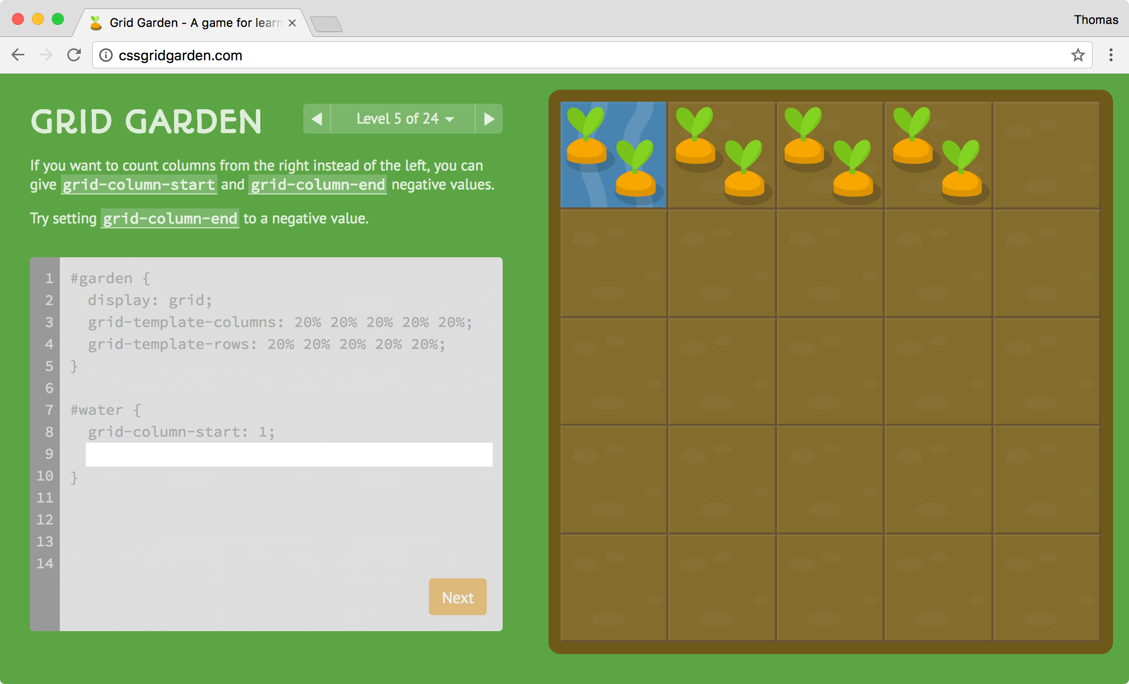
I’m pleased to announce Grid Garden, a sequel to Flexbox Froggy. This time, you’ll learn about CSS grid, the hot new layout module, and cultivate a carrot or two in the process.
Grid is cutting edge, with browser support landing just last month. What this means is that you’ll need to update to the latest Firefox, Chrome, or Safari in order to play Grid Garden. So hop to it!
Grid versus Flexbox
If you’re anything like me, you’re thinking to yourself, “We just figured out flexbox, now we have another layout technique?!” But just as position and float will continue to find use, grid and flexbox will coexist and fulfill different purposes based on their strengths.
So what exactly is the difference between grid and flexbox? In a nutshell, flexbox works along one primary dimension, with niceties like wrapping, alignment, and justification thrown in. Grid, on the other hand, works in two dimensions by defining rows and columns. Think table-based positioning, but with a separation of content and presentation.
More concretely, grid is good for laying out macro elements like headers, footers, and sidebars, while flexbox is well-suited to multiples of similar items, like lists of features, testimonials, and navigation links.
Learn More about Grid
My objective with Grid Garden is not to cover every last aspect of CSS grid, but to help players develop an intuition and recognize its potential. Things get left out, like the grid-gap property, grid-auto-columns, and custom naming of grid lines and areas.
Fortunately, there are some excellent resources to fill in the gaps, including Grid by Example, Jen Simmons’s experimentation, and CSS-Trick’s guide. And of course MDN’s comprehensive docs.
CSS grid is powerful and elegant (more so than flexbox), and should quickly become an essential tool in your web development toolkit. But don’t just take my word for it — play Grid Garden and see for yourself.
Thank you!
Thank you so much, you’re amazing.
Super cool. However if I uses the enter key the answer is shown but the text box waggles and doesn’t do nex
Do you have any clue for the challenges? I am stopped at the 22 rsrs
Note my reply below yours… it will give you clues (there are multiple possible answers, but he’s looking for a specific one).
This is great!
There’s a bit of a problem with level 22 though. Based on your instructions, I had to build it three different ways (the first two selected exactly what you specified as well). Perhaps you should make the instructions more clearly specify that you want 0 values for some of the rows? (Not breaking the 50px area into 4 rows?)
Cute ending. ;) One other bit of feedback — I think levels 23 and 24 are a bit tough because you render it showing the 5 x 5 grid to start (when nothing’s defined). It makes you feel like you need to come up with a solution that’s still 5-based.
Otherwise, great work! A fun way to learn the basics.
Hi Thomas, thanks for creating the grid garden. It’s a good learning resource.
What’s the correct solution for step 26?
It looks I solved it with grid-template-rows: repeat(4, 10px) 1fr; but I’m not getting a pass…
Thanks
Hi,You can try 0%.Good luck
JingYi’s approach also works, but the reason yours isn’t quite working is because you have 40px total instead of 50px for the first four rows.
repeat(4,12.5px) 1fr
Do you mind explaining how you arrive at this answer?
Many thanks! for creating wonderful learning space. Had awesome time and great fun, while getting introduced to grids.
Thanks for this great learning tool. A bit of feedback, I found Level 26 too confusing I think because of the pre-existing grid lines? Another thing is that the blue fill resembles water. I thought I had the solution based on the blue fill using 50px 1fr.
Thanks for your awesome game! There is also a version with No Hints for more challenge: http://christianrubiales.com/gridgarden-no-hints/
repeat(4,12.5px) 1fr
Thanks for such an excellent trainer!
I’ve created a step-by solution with answers explained, it might be useful for complete beginners: http://programmingmentor.com/post/playing-css-grid-garden/
Thanks. I was stuck on Level 26 and your explanation made sense.
Thomas, thank you for CSS Grid Garden. It’s educational and fun.
This is awesome, thanks for your efforts!
I was thoroughly confused by the Level 26 instructions.
I d loved FlexboxFroggy, and i love also this Grid Garden
Nice and fun work.
Thank you!
Terrific app for learning. Thank you.
Congratulations Thomas, amazing pedagogic work you are doing with Grid Garden and Flexboxfroggy, my students will really appreciate tomorrow!