I’m headed to Mozilla Festival this week, after spending the summer working for Mozilla Webmaker. Everything at Webmaker is a team effort, so I helped out on a number of projects and had a blast doing it. But I wanted to document my main effort — adding a tutorial feature to Thimble — from design to research to implementation.
Designing Tutorials
Thimble is a web-based editor that makes it dead simple to create and publish web pages. It’s often used to teach web development to beginners, with educators relying on HTML comments to provide inline explanations of the code. This summer, our goal was to give Thimble explicit support for this kind of instruction.
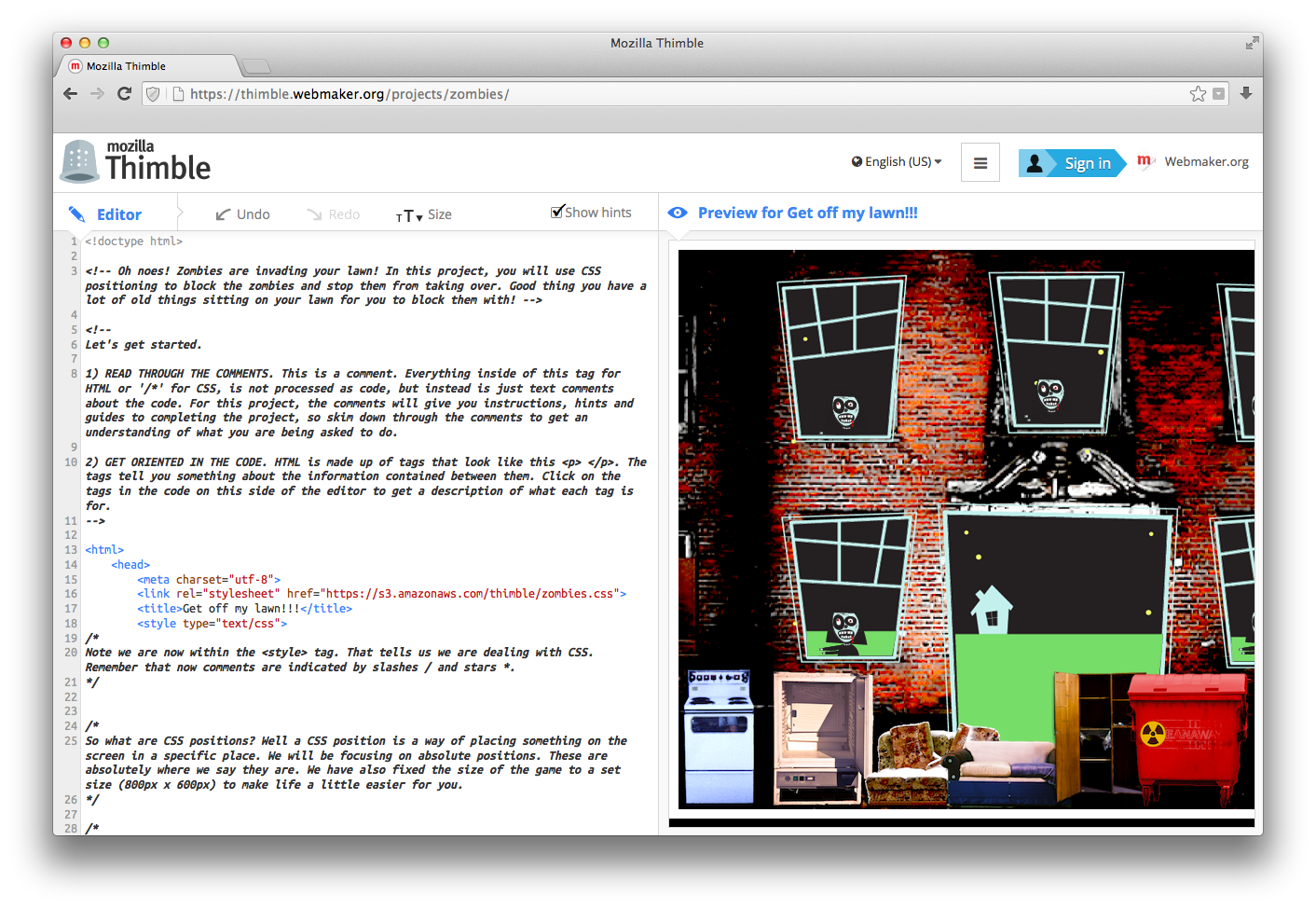
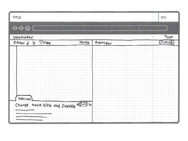
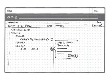
I started out the process by sketching mockups of potential designs with pen and paper. While I already had a sense of what direction I wanted to take it, this was colored mostly by unsupported assumptions and personal preferences. So instead I took a breadth-first approach, exploring many different designs and making use of user testing.
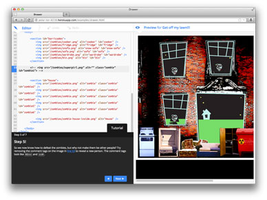
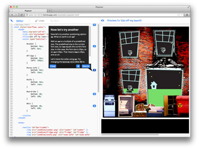
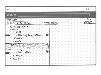
Eventually, I settled on five designs. Some, like Sidebar and Drawer, are already commonplace in coding environments. Others, like Expander, have more distant inspirations like Google Images and iTunes. I then turned these into functional prototypes. Some smoke and mirrors may have been involved.
You can hover over a mockup below to see how the eventual prototype turned out, and click to try it out for yourself.
Getting User Feedback
Next, I wanted to learn about users’ perceptions of the designs. To get as many people trying out the prototypes as possible, we ran an online survey. Respondents completed basic tasks using all five of the prototypes, as well as the HTML comments version as a baseline, in randomized order. They then rated them and answered a few brief questions.
92 responses were accepted, from 12 females and 80 males. Respondents averaged 25 years of age, ranging from 16 to 52, and representing 16 different countries.
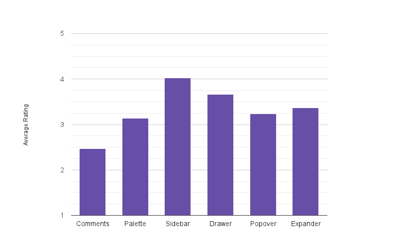
The graph below shows the average ranking given for each design on a scale of 1 to 5. As you can see, Sidebar was most preferred, followed by the similarly conventional Drawer.
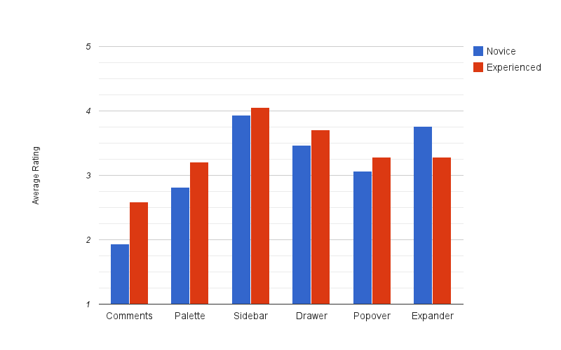
Breaking down responses by 17 novices versus 75 experienced coders of HTML, the trends hold for the most part. But Expander is a notable exception, its highly guided interface far more popular with beginners than experts. I should also note that Expander was the most complex design, and its prototype the most rough-around-the-edges, leaving plenty of room for improvement.
Implementing Tutorials
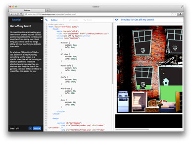
Based on these results, we built the Sidebar design. (For the record, my hunch at the outset was to go with Drawer.)
Basic functionality includes displaying the tutorial in a pane, toggling it into and out of view, toggling between two sizes, and switching between tutorials if multiple ones are associated with a document. You can see the results below.
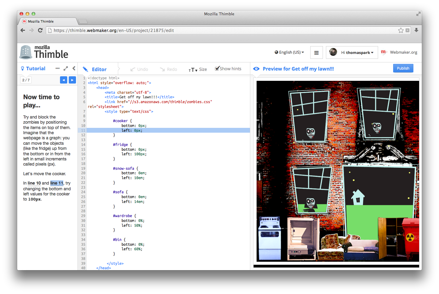
I also created options to automatically paginate a tutorial and enable a feature dubbed smartlines, which detects line references in the tutorial, turns them into links that highlight the relevant line of code on hover and smooth-scroll to it on click, and updates their line number as the code is edited. The resize button, smooth-scrolling, and moving the tutorial navigation from bottom to top are all a direct result of feedback given in the survey.
One interesting issue in implementing interactive behaviors across tutorial and code editor is that tutorials are displayed in a cross-domain iframe, even when that tutorial is another Thimble make. To overcome this, the tutorials must include a script that communicates with the editor via postMessage.
To implement all this, I had to learn the ropes in many systems, including Webmaker Suite, Bugzilla, and libraries like RequireJS and CodeMirror.
The commit is found here on GitHub.
How to Use Tutorials Today
As of this week, the tutorials feature is live! To link a tutorial to your own Thimble document, simply tag the document with the following, where the URL points to the tutorial:
tutorial-http://foo.com
Essentially any webpage can be used as a tutorial, but we provide a starter tutorial for you to remix and use. This starter tutorial includes the aforementioned pagination and smartline features. Of course you can always go your own road and build your own tutorials in Thimble, taking HTML, CSS, and JS as far as they will go.
Here’s the official SuMo article and Cynthia Ng’s excellent walkthrough.
Tutorials in Action
Some examples of tutorials:
- Rainy day
- Maps and geolocation
- A todo app
- Positioning zombies
- Tutorial on making tutorials
- Tutorial on making tutorials en español
Future Directions
Although the tutorial feature has landed, it’s far from finished. Among the features I hope to see are support for line ranges, a more powerful way to associate line references with code, an indicator for when a line is highlighted off-screen, draggable resizing, and state persistence. Line widgets in CodeMirror 3 also pave the way for Expander as an alternative interface.
On the research front, I’ve been looking for an excuse to conduct an eye-tracking study, and the different tutorial interfaces seem ripe for that kind of thing. And lest we forget, learning is a complicated phenomenon, and the survey only scratches the surface by probing first impressions. How the different designs impact understanding remains a wide open question.
Acknowledgements
My thanks to the Webmaker team, especially Brett Gaylor for giving me the opportunity this summer, Cassie McDaniel for helping get the research rolling, and Mike “Pomax” Kamermans for his invaluable code reviews. And thanks to all of you who took the time to complete our survey.

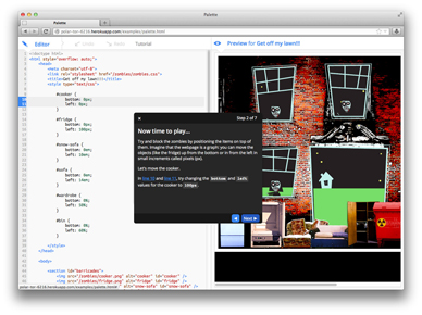
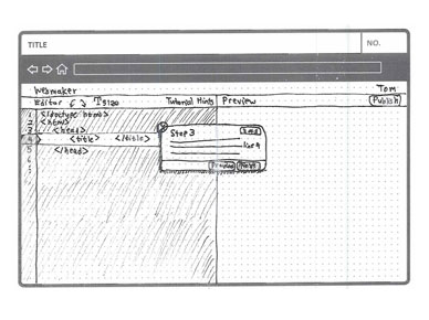
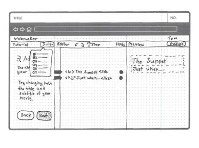

How did you get that epic hover effect for the images?
Does it use JS or CSS? And does it just fade-in an image on top, or does it do something more ‘hacky’?
Pingback: Hacks Decoded: Thomas Park, Founder of Codepip - Mozilla Hacks - the Web developer blog