One feature that’s often overlooked in iOS is adding webpages to your homescreen. You even get a nice retina icon if the webpage author designates one.
Naturally, my mind went to how this feature could be used for a prank: Replace legitimate app with fake. The fake looks exactly the same, but takes you to an annoying video instead. If you’re feeling really cruel, you surround the one real app with a screenful of imposters.
Spot the Instagram that doesn’t take you to a rendition of “Never Gonna Give You Up”.

I started by making a one-off site, but as programmers tend to do, I decided to generalize it. The result is iRoll.
How to Use
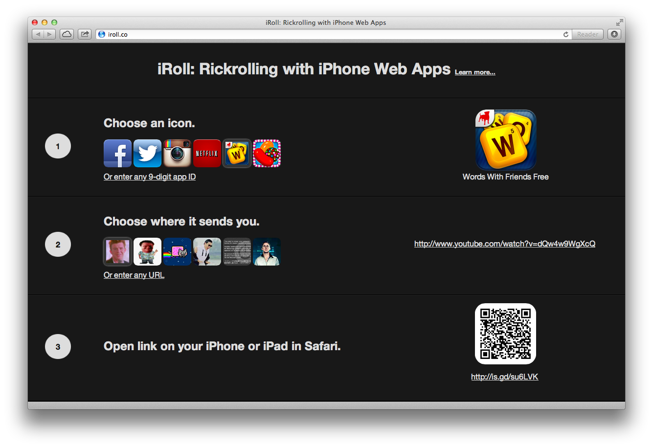
First, choose an app or enter a custom app ID — it uses this to grab any app’s name and icon. To find an app ID, go to the app in iTunes, right-click on the icon to copy the link, and then get the 9-digit number in the URL. For example, the app ID in the link below is 585259203.
https://itunes.apple.com/us/app/super-stickman-golf-2/id585259203?mt=8
Next, give iRoll a destination URL. This can be a Rick Astley video, a Rick Astley image, or anything else on the web.
Then, open the generated link on the target iPhone or iPad. You can email or manually type the shortened URL, or snap the QR code using a QR reader app.
Finally, open the link in Safari and save it to the home screen. In Safari, you’ll find the option by tapping the Send button, which you might have used before to email or tweet a link.
Let’s Talk Design
Technically speaking, iRoll is simple. It takes two inputs, app ID and destination URL, and formats a webpage with the app’s title and touch icon, and a redirect to the destination URL.
But using iRoll can be surprisingly complicated task, especially for the average end user. Sit Grandma down, and have her find an app ID, copy a link from her laptop to phone, and add the page to her home screen. See how that plays out.
So how did I design iRoll to simplify the task for users?

Progressive Disclosure
iRoll takes advantage of progressive disclosure. The task of creating a fake app is presented in simple, discrete steps. As you complete one step, the next comes into view, avoiding the overload that might come with presenting them all at once.
Take advantage of the third dimension. By that I don’t mean the z-axis — which is often ill-advised, but time.
Sensible Presets
iRoll’s design started with two input fields, for the app ID and destination URL. Simple! But getting an app ID is fairly involved, from the nonobvious way to copy an app’s link, to visually parsing the 9-digit number from it. On top of that, there’s a great deal of cognitive load in choosing an app.
To address this, iRoll provides a few preset options for both app and URL. They lower the bar to getting started with iRoll, and signal to users how it can be used.
Provide options that cover what you assume to be the “fat head”, while offering freer input for the “long tail”.
Little Big Details
Finally, the main use case for iRoll is generating a link on your PC, and then copying it over to your iPhone or iPad. Unfortunately, moving digital data like a URL from one device to another still involves a great deal of friction. Recognizing this, I provided a shortened URL and a QR code.
Look for the little touches that can oil the wheels, or simply delight.
It goes to show that what’s initially a simple app to build can morph a great deal once the user experience is taken into consideration.
Notes
App names and icons are pulled from Apple’s iTunes Search API.
URLs are shortened using the is.gd API.
There are a few JavaScript libraries out there for generating QR codes, but qr.js by Kang Seonghoon worked best for me.
Check out the source code on GitHub.
