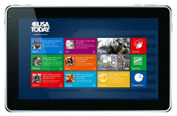
Yesterday, Microsoft’s Steven Sinofsky responded to chatter about how Windows 8, in its grand debut, was demoed almost exclusively in landscape mode. In the post, he affirms Windows 8’s agnosticism.

Our point of view is that both portrait and landscape orientations are important, and experiences can be great in either orientation. Rather than picking a posture and orientation for optimization, we designed an experience that makes sense regardless of how the device is held, one that feels tailored for the app and its content.
Ignoring that the first Windows 8 tablet from Samsung has its hardware button positioned to make landscape the default, and the packaging to reflect that (in contrast to the iPad), Sinofsky’s response still rings true. This informal survey from Ben Brooks further underscores his point.
This naturally leads to questions about when and why people might favor one orientation over the other. Most users probably hold their tablets in landscape to watch videos and in portrait to read long-form text. But what about for all of the other ways tablets can be used?
Some Stats
Since I’m not privy to data that might answer this, I thought an interesting proxy might be to look at how apps are presented in the App Store. Do apps tend to feature screenshots in one particular orientation? Are there patterns among certain classes of apps? This reveals a bit about how apps are designed to be used or how the developers idealize it.
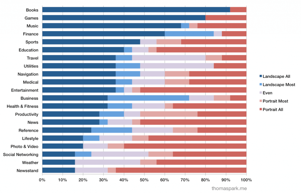
I went through the top paid iPad apps, as well as the top 25 for each App Store category, and classified each into one of five categories: all of the screenshots are portrait, or landscape; most (all but one) are portrait, or landscape; and they’re about even (more than one of each).
Here’s how the 200 top paid apps look.
Surprisingly, only 21 percent show off their app in both orientations.
Despite the primacy of portrait in Apple’s iPad marketing, the majority of top paid apps use landscape in theirs, at least within the App Store. That’s no guarantee of course that this is how people spend most of their time on their iPads, using these and other apps.
Not all categories are represented equally in top paid apps, which happens to be extremely game heavy. By looking at each App Store category individually, a better picture emerges of the diverse ways that iPads are held and used.
Platforms today are recognizing that great user experiences have the potential to be created in either portrait or landscape, and this is certainly an important first step. But this graph renews questions about when and why developers choose one orientation over the other, and what opportunities there are for both new and existing apps to make better use of the available space, however the tablet is held.
Given how only 21 percent of iPad apps show themselves off as fluid between landscape and orientation, one wonders if Windows 8 developers will be up to the task of building apps in both orientations, plus the snap and fill views, for so many resolutions and aspect ratios — and doing it well.


Any explanation as to why book apps would be more landscape while magazine apps would be portrait?
Most of the book apps turn out to be children’s books or otherwise richly illustrated. The adult reading mostly falls under News, Newsstand, and within iBooks.
My experience (as a UI/UX designer) is that people when reading long text, prefer to read short width multi column passages so the head does not have to engage and all the reading is done by small movements of the eye. This also makes the text seem more compact and organized on the screen. Many e-readers can (and do) display 2 column when in landscape – and this is “easier” on the mind/body.
News, weather, Facebook, etc. often require scanning a page for content that is fragmented (images, media, copy) so the desire to get more content pieces on a screen is easier facilitated on a portrait screen.
Picture your daily print newspaper and imagine if the articles were all the full width of the page…
Makes no sense I’ve never read a book in landscape mode on my iPad. Boggles my mind how people pick stats out of thin air.
Agree. Reading books in landscape mode is weird.
Did you find an orientation preference when reading email?
Wow, so people would rather use their hands more than use their eyes? The only time my iPad is in portrait mode is when I’m reading a book. I do that because it generally gets more content onto 1 page and I don’t have to change pages as much. I would rather scan up and down with my eyes more than use my hand to flip pages. It’s far more work to flip pages, especially if you generally hold the tablet with 1 hand while you read.
As to why I prefer landscape, I’m right handed and I like have the home button under my thumb. I can scroll up and down or left and right with the thumb on my right hand and I can also click the home button with it. If I’m holding the tablet in portrait view, I now have to adjust my had to get to the home button.
My news reader app is Zite and I use that in landscape mode. I don’t use that in portrait.
I also prefer to have a navigation on the left all the time as opposed to having one that drops down over the content.
Maybe this is more of an indication of people doing what they are told to do and not really doing what’s preferential to them. The iPad is always displayed in portrait mode so people are conditioned to use it in portrait mode first and only switch to landscape if there is difficulty?
And do the same numbers hold up for 7″, 9″ and 12″ tablets? The bigger the tablet, the more it weighs, the more it weighs, the harder it actually is to hold it with one hand in landscape mode. It’s a longer lever and the center of gravity is further away from the hand.