I’m not the only one who’s noticed that blue icons seem to be totally overrepresented. But is it really this bad, or is the confirmation bias just acting up again? I decided to find out.
The Method
From each of the twenty iTunes categories (e.g., books, business, education), I collected the icons of the top 30 paid iPhone apps. I used the Python Imaging Library to run through these images pixel by pixel, classifying them into 11 main colors and tallying them up.
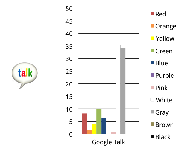
Here are a couple of examples shown by percentage. Chat for Google Talk:
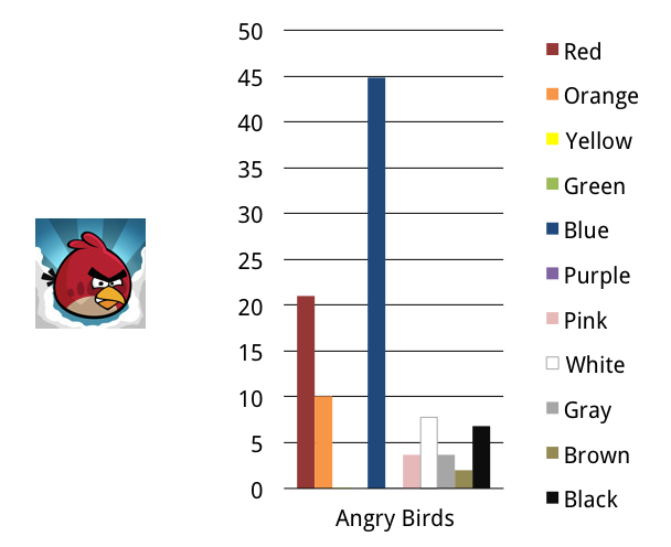
And Angry Birds:
At this point, I could have aggregated all of the pixels across all icons and counted their colors, but that didn’t seem very informative. Instead, I focused on the major colors of each icon, which I defined as making up at least 30 percent of the pixels. With this criteria, the Google Talk icon is white and gray, and the Angry Birds icon is blue.
The Results
Here’s how the colors broke down for each category (click to enlarge):
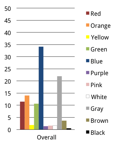
And the aggregate:
Blue icons were indeed the most common. But while I expected half or more of the icons to be blue, it came closer to one-third. Even at that level though, blue far exceeded the other colors. This is a shame, given that some of my favorite iPhone icons (e.g., Delivery Status, Instagram, Paprika) use little to no blue. The worst offenders in this regard were travel and navigation apps, half of which were blue.
Black was the least common color for an icon. There were also very few yellow, purple, pink, or white icons, so if you want your app to stand out, there you go.
Pink was most popular with health & fitness apps. Make of that what you will.
A couple of things I took away from the process. First, I couldn’t find much help in the way of information or software for reducing a million colors down to the ones you’d, say, find in a Crayola 12-pack. You can accomplish this by carving out the color space, but as this chart from the xkcd color survey shows, the colors we define are quite idiosyncratic, both as a product of human perception and as an artifact of human culture. I ended up converting from RGBA to HSL, which made it a bit easier to come up with clunky heuristics to classify the colors.
Second, the illusory nature of color. Juxtaposing different colors skewed them, the sizes of the backgrounds were overestimated, and shadows threw perceptions off. A case of the human mind outsmarting itself. This makes it tough to give an accurate account, when a pixel is technically one color, but people all perceive it to be another. Most of the time, it’s the perception that matters.


Neat observation–I see the share icons on the comment page have a lot of blue. The question that immediately jumps out at me is “Does this represent the successful icons or is this more general?” So if you took a sample of random icons in a category or in aggregate, would they also be blue? And if one can get the icons from the beginning of the app store, was there a trend to blue as blue became successful? Do blue icons populate the Mac App store? When did the blue begin? Looking at my iMac, I see the main Mac icons as blue (Finder, Safari, iTunes) but not iLife icons (they are more yellow scaled).
OMG, I see blue everywhere now. Thanks for that.
Good call on even the share icons being blue. I would say that this trend toward blue has always been with us. Take a look at this 2003 Wired graphic on corporate logo colors.
But it is an interesting question if and what effect it has on success. Clearly designers prefer blue — but do users?