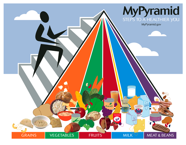
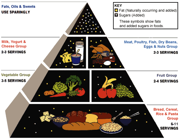
The other day, I was having breakfast and scouring the cereal box for reading material when I came across the new food pyramid. What had they done!

This version apparently replaced the old one back in 2005. No doubt the actual content of the original was highly dubious, but it’s hard to argue against its memorability. I can still picture the carb foundation and fatty capstone like it was yesterday.

Unfortunately, with the new version, a lot of what made the original effective was lost. Let’s run through the issues from an information design perspective.
Mixed Signals
Is the new pyramid just a logo, or is it conveying more specific information? It’s not clear at first glance. The old pyramid communicated its purpose as an information graphic and primed the mind for interpreting it this way.
Missing the Point
The value of a pyramid diagram is in using its shape to represent hierarchical or proportional information — large bottom to small top. In the new pyramid, the sections are proportional but drawn as vertical bands! The USDA give two reasons for this change. First, to emphasize variety, that you should have something from each food group every day. Fair enough. Second, to emphasize moderation, the wider base of each band representing that you should have more foods with low fat and sugar from that group, and the narrow top meaning less foods with high fat and sugar. I kid you not.
Not Enough Info
Sometimes a picture is worth a thousand words, but a bit of text can have a multiplicative effect. The widths of the colored bands vary and are meant to be general guidelines. But precisely what is anyone’s guess. Should we strive to balance the food groups equally, or cut down on meats and beans? Should we have more grains than anything else, as clearly suggested in the original? And what is the yellow band?
Hidden Messages
Did you realize that the white tip of the pyramid represents discretionary calories, such as from candy and alcohol? Me neither.
Jack of all Trades, Master of None
The food pyramid is supposedly a “food guidance system,” yet crammed in is Clippy McClipartson scaling it to symbolize the importance of physical activity. Let’s work on the “food guidance” part.
Chartjunk
Giving examples of each food group is a great idea, but the execution needs improvement. The cluttered layout and horrible quality of the clip art make it more distracting than informative.
The bottom line is, does the new food pyramid help people make informed decisions about the nutritional value of their meals? I would argue not. Effective information design hinges on a message that is consistent and focused. The new food pyramid, which reeks of design-by-committee, fails on both accounts.
What can be done then? I suggest stamping the pyramid in big, bold text with “MyPyramid.gov” and moving the Daily Food Plan to the front page of the website.
