A post on my impressions of Ubuntu 11 led to lots of thoughtful discussion here and over at Hacker News. The part that seemed to generate the most interest was my take on why certain menus seemed so troublesome.
And while I described the problem in some depth, I glazed over any solution. So here I am to expand a bit on how Unity’s menus, and menus in general, might be improved, once again applying the angle of escape concept and pulling examples from the Mac.
Recap
I observed that when trying to select a menu item in Ubuntu, it’s quite easy to accidentally trip another menu. Due to the aspect ratio of Ubuntu’s menus, which tend to be taller and thinner, their angles of escape are often smaller than their Mac counterparts. Highlighted yellow in the screenshot below, you get 65 degrees with the Apple menu, compared to 50 degrees with Ubuntu’s system menu. This difference seems to have a noticeable impact.
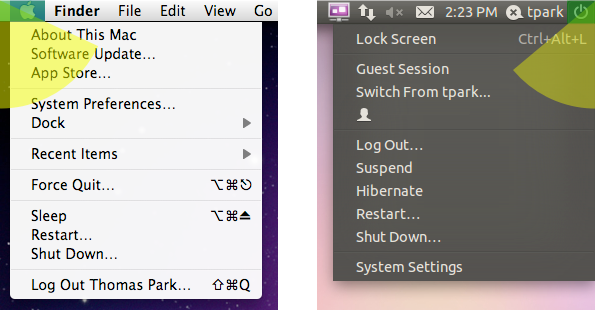
Further, let’s assume that users have two tendencies: to target the text of a menu item more than the whitespace, and to move in a straight line to their target. I believe these are reasonable hypotheses, at least for novices who haven’t trained themselves out of this behavior yet. Then due to Ubuntu’s placement of the menu item text in the example above, the problem is only compounded.
Resize the Menu
So what can we do about this? A straightforward approach is to increase the width of the menu. This helps the menu both as a target (invoking Fitts’ Law again) and as a point of escape, a double win.
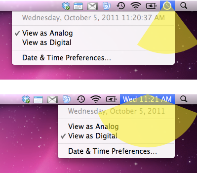
But while it helps visibility and targeting to a lesser degree, increasing the height of a menu actually hurts escapability. This is something to consider when comparing OS X’s 21 pixel menu bar to Ubuntu’s 23 pixels.
Buffer Time and Space
Since the ’80s, both Apple and Microsoft have dealt with escapability in the context of hierarchical menus, each addressing it in their own way. If you were to treat hierarchical menus at face value, the user would have to steer carefully across the width of a menu item to avoid triggering a neighbor.
Microsoft’s solution was, and continues to be, to keep the submenu displayed for an extra split second, regardless of your actions. If you’re quick enough, you can get to the submenu taking any path you wish.
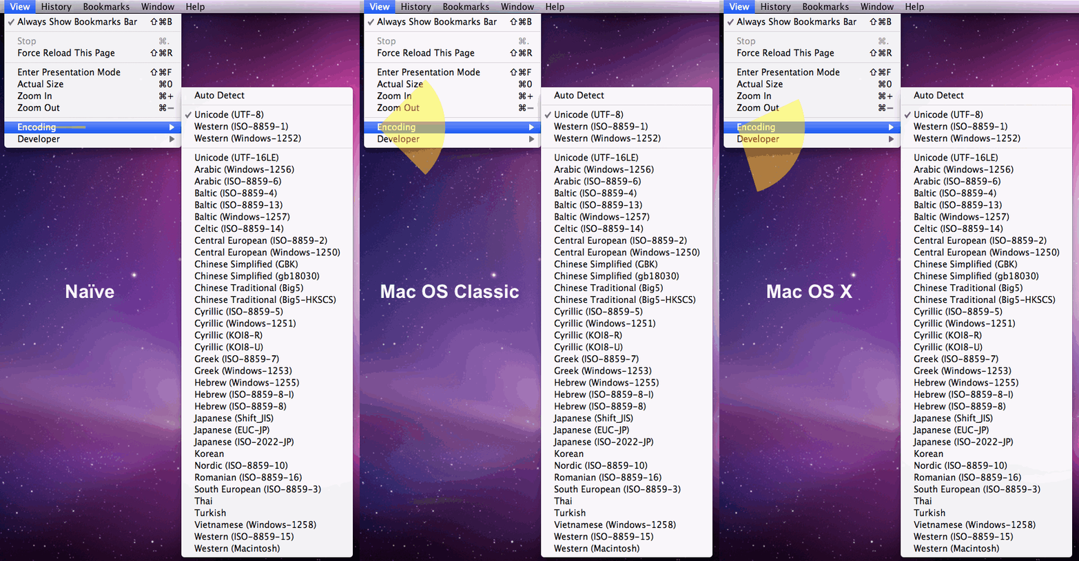
Apple’s solution in Mac OS was to widen the angle of escape to 90 degrees, so that as long as your movement was more horizontal than vertical, the submenu would stay open. Bruce Tognazzini, the original drafter of Apple’s HIG, talks about both approaches here under question 6.
This went away in the transition to OS X, but has since returned in a smarter form. Now the angle of escape is based on the size of the submenu, as long as you maintain a certain speed. Ubuntu takes a similar approach, but none of the OSes apply it to the main menu bar.
In the image below, you can see how the naïve, classic Mac OS, and Mac OS X approaches compare in their angles of escape.
Make the Menu Sticky
Another approach is to make the menu sticky. Once clicked, it stays activated until you click elsewhere, maximizing the angle of escape. The tradeoff here is that it prevents you from performing the “piano slide” to scan multiple menus quickly. This makes it best suited for specialized menus.
Likely for technical reasons, third-party menu extras on the Mac take on this property, though Apple’s own menu extras do not. Apple’s Spotlight menu (which, it should be noted, is in the same position as Ubuntu’s system menu that started this whole discussion) quite intentionally gets the sticky treatment.

Ubuntu might find good use for this approach in the right half of their menu bar.
Change the Target
A final approach is to offer visual cues for staying within the angle of escape. This might be achieved by keeping the menu item area narrow, dropping wider items further down the list, or lengthening the text of shorter items to fill the space.
Strong highlighting, as found in OS X and Ubuntu, also encourages users to use the entire width of the menu item. While the highlighting in Windows 7 is more subtle, menu items are rendered as buttons on hover, similarly signaling that the whitespace can be clicked.
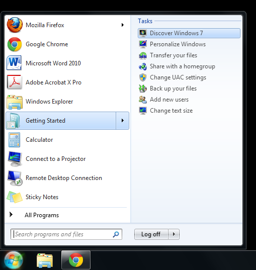
To wrap up, let’s take a look at the volume controls in Mac OS X, Windows 7, and Ubuntu below. On Mac and Windows, the control stays within the angle of escape (though it doesn’t matter on Windows because theirs is sticky). On Ubuntu though, it extends well beyond it. This video demonstrates the problem in motion.
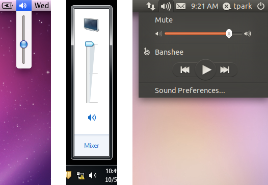
The obvious solution is to make Ubuntu’s volume control vertical. But we don’t necessarily have to follow the convention of other OSes to make it usable. We could make the menu sticky. We could add a time or space buffer. We could reorder the menu items. We could resize the menu or slider control. Or we could do some combination of these.
Sure, this is all sweating the small stuff. But multiply that over a whole operating system, and that’s how you end up creating a great user experience.

sometimes is not very huge deal, but i agree with most things out lined and suggestions
but unlike windows’ dumb button, all linux desktops i tried react to the mouse wheel, so simply hovering over the sound icon and scrolling is much quicker than clicking twice and moving your mouse.
@Flying Sheep
The scroll wheel feels like bonus functionality, it’s not very intuitive. Especially when scrolling up and down moves the slider right and left. You can’t expect users to use the ‘poweruser’ functions, so the obvious controls should be easy to use.
The mouse wheel works fine to control the volume on WinXP and WIn7. Click Once on the sound icon and then scroll the wheel. There is no need to double click or drag anything.
Great read. Thank you!
Wow. I never knew all the subtleties involved in design an operating system that offers a great user experience. Looks like I still have a lot to learn. Thanks for sharing this.
Maybe they should do what Amazon does: http://bjk5.com/post/44698559168/breaking-down-amazons-mega-dropdown