Like most web developers, Google Fonts is an indispensable resource for me. What would otherwise be a choice between sticking to a small handful of web safe fonts or wrangling WOFFs, OTFs, and TTFs is solved with just two lines of code.
Clicks and Conundrums
While Google Fonts is a valuable tool, its interface leaves much to be desired, a fact that hasn’t escaped the attention of folks like Laura Franz or Sascha Grief. As a devoted user of Google Fonts, I’d like to add a few of my own pet peeves to the conversation.
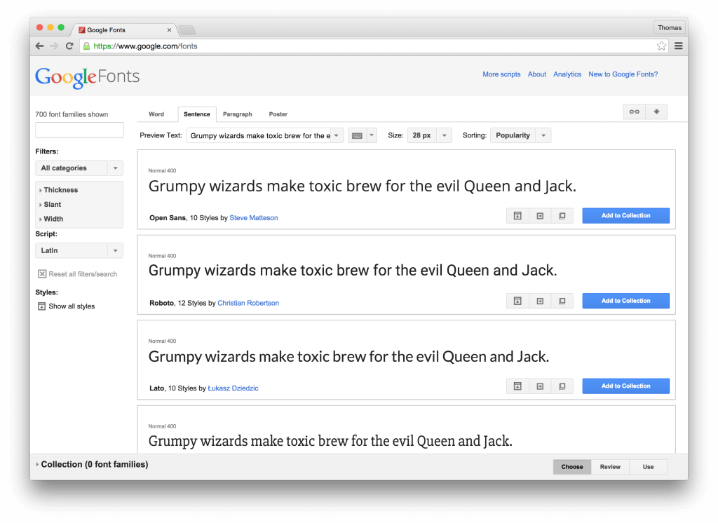
First, one of the most common ways people arrive on Google Fonts is through a web search. The page you’ll land on, while admittedly chock full of interesting history and statistics, doesn’t include the information you’re there for.
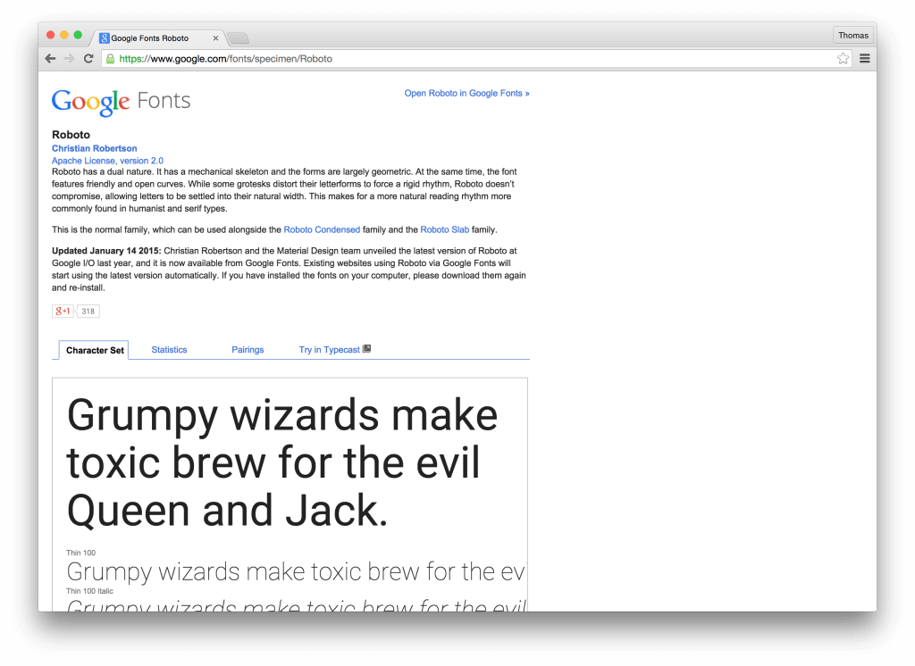
For that, you’ll need to click the “Open in Google Fonts” link in the top right. “I thought I was already on Google Fonts,” you might wonder.
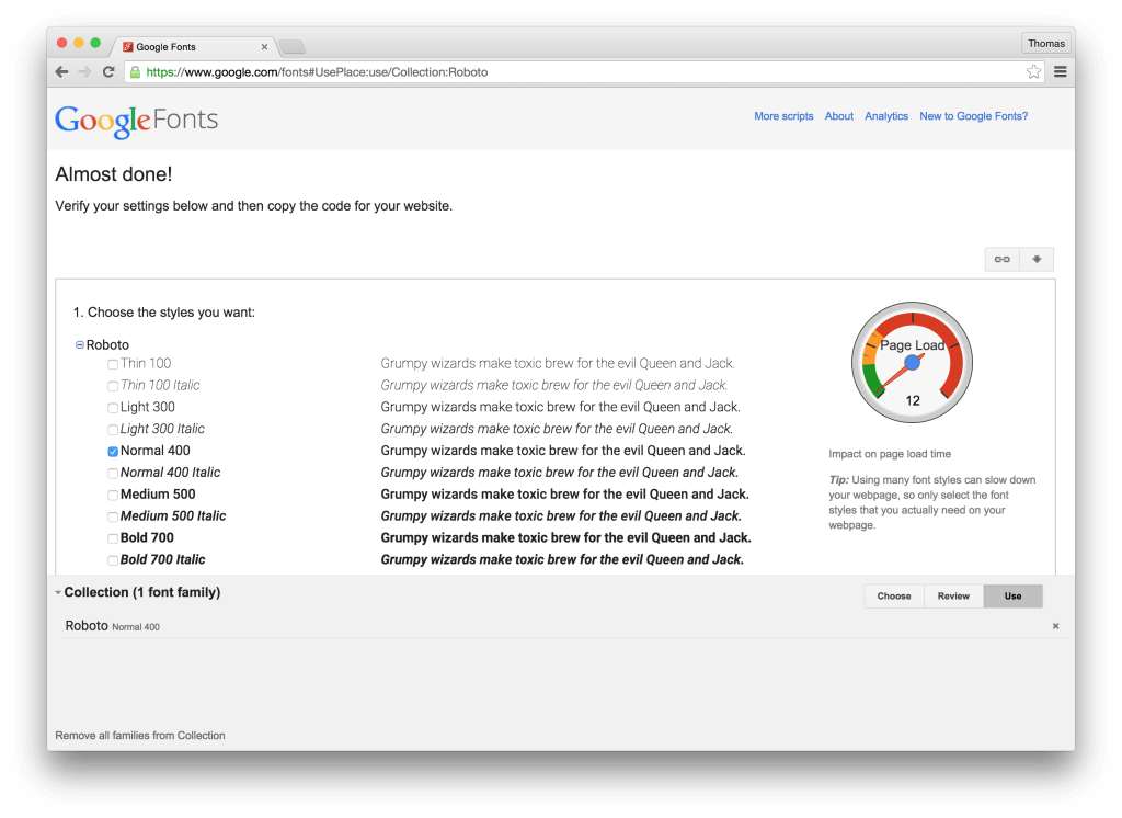
Second, the Google Fonts interface is peppered with buttons, many unlabelled, that always give me a half-second pause. “Which one do I click to start using the font?” Hint: it’s not the bright blue button that beckons.

Finally, Google Fonts includes a lot of directions and tips that are useful for the first-time user, but after the 100th visit, only serve to waste space. Add fixed bars at the top and bottom of the page and you end up with the most crucial bits below the fold, maybe even buried in a hidden tab.
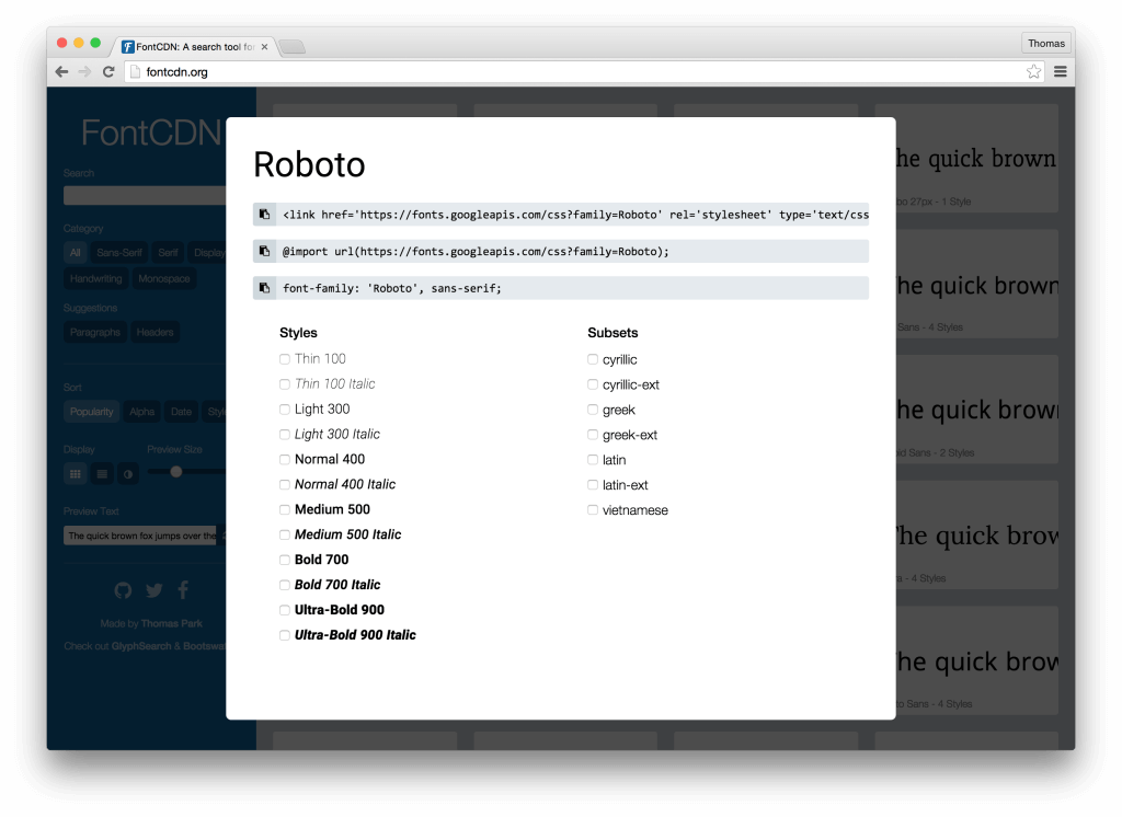
Enter FontCDN
Last week I tried my hand at building the Google Fonts interface that I wanted to use. The result is FontCDN.
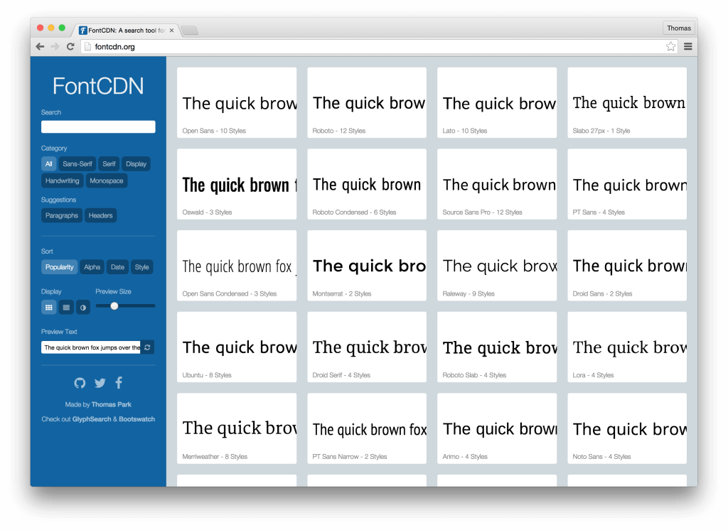
FontCDN addresses a different use case than what Google Fonts seems to be designed for. Rather than deeply exploring and comparing different fonts within Google Fonts or within a prototyping tool like Typecast, the goal of FontCDN is to quickly grab the fonts you’re interested in and try them out within the context of your actual project.
You can sort and filter the 700+ fonts available on Google Fonts any which way. You can even browse fonts that have been recommended around the web, a feature inspired by Typekit.
Click a font to view the import and style code. Click a button to copy it to your clipboard. There’s no step three.
Give FontCDN a try and let me know what you think.
Lessons
Performance was a priority given how resource-intensive it is to browse hundreds of fonts, and using React was one of the keys. But there are surely many more optimizations to be made. If you want help out, the project is on GitHub.
While JSX resides in some kind of uncanny valley, the componentization and render methods made it worthwhile. So much so that when it comes time to revamp GlyphSearch, I’ll probably give it the React treatment.
On a final note, hat tip to WebPack, React Infinite, and Web Font Loader, which saved me a boatload of effort on this project.
Response
My announcement of this project was retweeted by the official Google Fonts account (@googlefonts). Not only did they seem to take the critiques in stride, but soon after they released a major overhaul of Google Fonts that was in the same direction as my approach — and about a mile further. Clearly it had been in the works!
Blog post: A Better Way to Search Google Fonts. http://t.co/UlxHaQtyqP
— Thomas H. Park (@thomashpark) August 4, 2015
Hello Thomas, your new google fonts search site is really nice. We run a font site, and have been debating building something like this internally to search our own webfonts, which is around 30,000+ fonts now. We are little known, more independent, niche font provider based in USA/Thailand that has actually been online since 2002. I was curious if you were interested in working together on anything font related?
Checked our your site, lots of amazing fonts. Drop me an email with what you have in mind!
wow! simple and fast and usable :)
the only one i miss is a “view all styles”.
I like it!
Feedback: The first time I told someone your URL… they were adding an “s” to the end of “font”. (Say your domain name aloud and you’ll see why.)
You should register that domain and make it redirect to your actual URL.
Just stumbled across this today, and it’s a great tool. Bookmarked it as I’m sure I’ll be using lots in future.
Really cool tool…will save hours of clicking back and forth!
Would be really handy to have a ‘CAPS’ ‘Lowercase’ button just to get a quick switch when looking at styles.
This is exactly what I needed. Thank you!
Nice Article.
Congrats! Amazing work, very useful! :D
Very cool! I made fontSwitcher (http://codepen.io/freginold/pen/vLJewY) to try to make it easier to grab Google fonts, but this is much handier. Thanks for sharing it!
Nice, I do like the option you give to specify target class.
The revised Google Fonts UI has many advantages but for the serious professional who has a thundering stampede of projects, all of which have to get out the door yesterday, the new interface is an absolute productivity killer.
It is like casually flipping through the pages of a design magazine while sipping a cup of green tea with the aromatherapy candles going. If the extreme right-brain folk want this, great — power to ’em — but some of us professionals need to get things done and hit the darned deadlines.
There is no longer an option of the previous list view. One of the advantages of the previous version was that it displayed more fonts per click on the scrollbar than the new version. I’d rather be able to quickly scan through 10 at a time than six.
Also, if you want to compare fonts, you need to compare the CHARACTERS. not just the overall look and feel. It used to be possible to see all the fonts with the same sentence or all in alphabet view. When you have a mixture of sentences, it can make you nut looking for specific characters to compare. (Try using the current design when you need to compare W’s or whatever – its hugely impractical.)
Google needs to offer both approaches so that everyone can be accommodated.
Honestly, the all-or-nothing change reminds me of how Apple does things: the tunnel-visioned genius approach. They bring in someone with a stylish demeanor, who impresses them with their aire of coolness, then the expert imposes their own views (and their own limitations) in defining how things should work. They come up with something cool and stylish and they toss practicality and efficiency right out the window. (It also reminds me of the Ive sensibility: come up with an insanely thin font that is impossible to read at small sizes, tell everyone it is cool, and then everyone and their mother are using skinny fonts at small sizes, regardless of circumstance.)
Big outfits like Google need to take all users into account, not just one group.
Big outfits like Google need to take all users into account, not just one group.
> It is like casually flipping through the pages of a design magazine while sipping a cup of green tea with the aromatherapy candles going.
Hilarious. Hey, sometimes when looking for design inspiration, that’s exactly what you wanna do. But agree that a lot of UIs coming from Apple lately have been designed to look great in screenshots, at the cost of real usability, especially for power users. It also seems that a lot of developers work day-to-day on 30-inch UHD displays and optimize for that.
By the way, there is an option to change the preview text. A bit inconvenient since it’s not the default and buried under a couple of clicks:
I find the best way to evaluate a font is to apply it to a whole web-page (MY webpage). Would be awesome if you could make a font-picker extension. There’s this one, but interface and performance are terrible. https://chrome.google.com/webstore/detail/google-font-previewer-for/engndlnldodigdjamndkplafgmkkencc?hl=en-US
thx!
that google extension interface “terrible”, it’s actually got awesome features (like CSS selector, and embed codes). But option buttons for the list is kinda lame, and when you re-open it the picker, it doesn’t go to currently-applied font. The best feature is you can PICK FONTS WITH ARROW KEYS (without using the mouse). cheers!
I want to add beautiful Google fonts to my wordpress website. How can I do that. Is there any plugin available.
Pingback: FontCDN 更好用的 Google Fonts 网页字型搜寻工具 - 免费资源分享 - 免费资源分享
Hopes were dashed when I used FontCDN the first time. Perhaps my need isn’t what it can do.
Needed an Art Nouveau-styled font, so headed to Google Fonts which returned 7 out of thousands of fonts for the search “art nouveau” with, as usual, no way to see more.
Entering Art Nouveau in search on FontCND returned… nothing. Guessing it doesn’t search by keyword, which seemed weird.