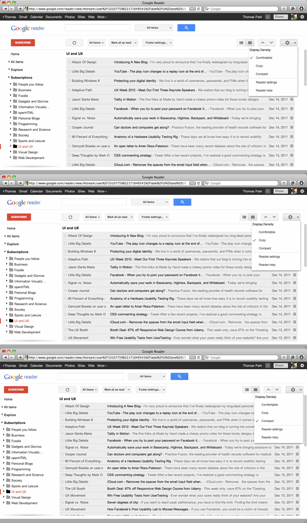
Google has been making sweeping changes to the look of their products. One of these changes is the addition of density control. With a couple of clicks, users of Gmail and Reader can now switch between a comfortable, cozy, and compact display.
It may seem like a totally unremarkable feature. But here’s why Google deserves credit for it.

It’s Uncommon
Density control is surprisingly rare. It’s not to be confused with zoom, which is found in all sorts of applications from web browsers to Office. Zoom enlarges everything, whereas display density changes only the spacing between things. In Reader for instance, comfortable, cozy, and compact all use a 13-pixel font, but give items a height of 37, 31, and 27 pixels respectively
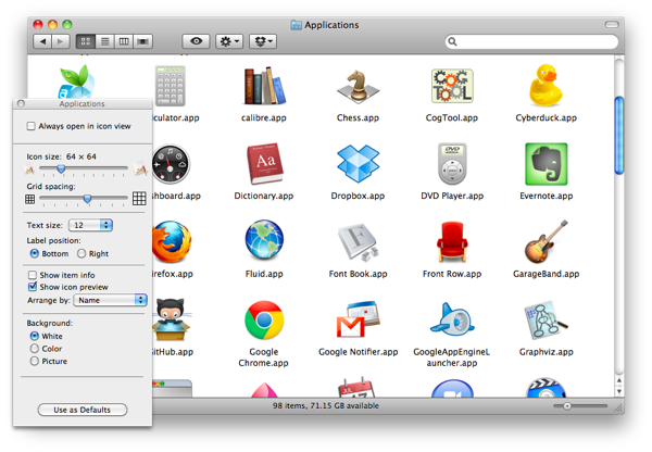
Only spatial file managers come to mind as another example. Though I’m sure there’s a laundry list of others I’ve forgotten.

It’s Useful
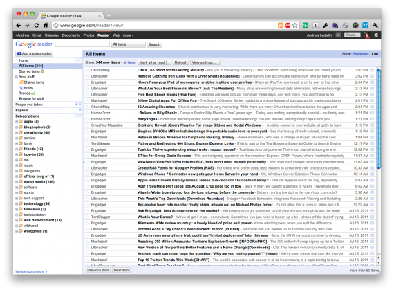
The old Gmail and Reader were most like the compact setting, packing lots of information into the available space. Yet it’s apparent that Google’s designers now prefer comfortable as the default for desktop resolutions.

Many power users want information density at all costs, while others want the greater accessibility or readability or aesthetics that spacing brings. People can be extremely sensitive to these preferences, especially when dealing with changes to a familiar interface (the Twitter iPhone client is a recent case of this). And this is where density control comes in.
Instead of a temporary measure meant to appease a grumbling user base, I hope this is a sign of what’s to come in other Google products. Users of Search, Docs, and News could also benefit from density control. In fact, it’s something we should see more of in general, particularly for information-dense applications.
