The Building Windows 8 blog offers some fascinating insight into Microsoft’s research and design processes. Take the recent post on improving Windows Explorer.
It begins with a discussion on how Windows Explorer is used today. Through telemetry data — “based on hundreds of millions of individuals opting in to provide anonymous data about product usage” — Microsoft finds that the top 10 commands make up 81.8% of use, and that these commands (e.g., paste, properties, copy) are primarily accessed through the contextual menu.
The development team combines this with customer feedback on the top requested features, and uses this to justify the changes from Windows 7…

…to the design below.

It seems that essentially, every single command that customers have used or requested has been moved into a ribbon or wedged into some corner of the chrome. And many are rightfully lambasting it.
But, you might protest, they did research! With users! And got a ton of data! So how did it go wrong?
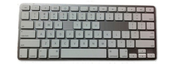
The IROP Keyboard
By focusing user research on low-level operations with the old system, and using that as the starting point for the redesign, you end up merely resizing, rearranging, and removing parts of the interface. You don’t make the quantum leap, and you sometimes make things worse.
I’m reminded of a recent paper by Andreas Zeller, Thomas Zimmerman, and Christian Bird (the last two authors from Microsoft Research, ironically) titled Failure is a Four-Letter Word: A Satire in Empirical Research.
In the paper, the authors collect keystroke-level data in Eclipse and correlate it with programmers’ errors. They find this data to be an excellent predictor, with the letters “i”, “r”, “o”, and “p” guilty of the strongest correlations. Based on these findings, they come up with a cheeky solution for reducing programmers’ errors:

The IROP keyboard addresses the data, quite directly. But it obviously misses the deeper problems.
From Actions to Activities
In the vocabulary of Donald Norman, operations combine to make actions, which make tasks, which make activities. According to this scheme, Microsoft has with their data looked at actions. The key is to start higher up this hierarchy, considering the activities users are engaged in and the goals they’re trying to achieve.
Windows Explorer is gradually being sunset, so they get some slack here. But I sure hope they aren’t being steered wrong elsewhere by their user research.

What I am instantly reminded of is the opposite approach: Steve Jobs just knowing what would work for people.
Or, to be a bit more nuanced: Hiring top creative agencies to develop a dozen independently and fully realized prototypes then choosing the best one and refining the hell out of it.
Agreed. The irony here though, is that, though Jobs may have been a master of ergonomics and UI design, you could pull in any idiot off the street and they would make a better job of UI design than MS has been doing recently
Don’t blame user research for the Windows 8 Explorer ribbon. :) That was an edict from execs who invented it for Office and are so infatuated with their creation that they will apply it to any product they get put in charge of. Some poor UX researcher was given the thankless task of producing data to justify the foregone conclusion.
Moral of the story: not everyone with Steve Jobs’ self-assuredness has the talent and insight he had.
Win8 Explorir sure looks fugly when compared to Vista’s that way, but it has qualities. To be short, noobies and lambda users never ever use a menu if they don’t have a compelling reason to, thus never know what they can do. Just for that, this far-from-perfect (they could trim down some buttons here) ribbon is worthy. For others more knowledgable users, well just reduce the ribbon I guess.
some things mandatory to me
– move/copy to
– selection operations
Aside from the praise for Steve Jobs whose saintly insights have hopefully been implanted on iphone5 for future MAC success. Explorer and file managers everywhere are broken. If they want to fix it start first with alternatives people actually use instead of Explorer. Hmm Copy/Paste is top? More likely it needs a better way to just move, copy, delete and rename files. Power users want more but the regular folks just want to find and move their files. It’d also be great if MS actually kept third party apps from adding extra files to the Windows key folders. When I install an OS a year from now the size and folders of that OS should be identical with the sole exception of what should be rare security updates and patches. KISS still holds true!
This is wildly off-topic, but do you realize that your site looks like total crap on Windows? The fonts are total crap. http://grab.by/b51l is what this looks like on Firefox, Chrome, Opera, and IE.
I hate the Libraries in Windows 7. I loved Windows XP’s explorer. Seriously. Now that we’ve got used to it now we got a new one :(